---
title: Custom Charts for Metrics Using Multiple PromQL Queries
description: Add multiple PromQL queries to one custom chart panel to compare related metrics, looping each query's results to plot combined series or dual-axis charts.
---
This guide extends the previous page on [building custom charts using a single PromQL query](https://openobserve.ai/docs/user-guide/analytics/dashboards/custom-charts/custom-charts-for-metrics-using-promql/).
You will now learn how to add multiple PromQL queries in the same panel, inspect their combined results, and build a chart that displays the output of several queries together.
:::note[Note]
This feature is useful when you need to compare related metrics across queries. Examples include comparing CPU time with CPU usage, or comparing memory used with memory cached.
:::
:::note[Before you begin]
Adding more than one PromQL query does not change the structure of the PromQL result.
Instead of one entry in the data array, you will receive one entry per PromQL query.
**For example**:
- `data[0]` contains results of the first PromQL query.
- `data[1]` contains results of the second PromQL query.
- `data[2]` contains results of the third PromQL query.
Each entry keeps the same matrix format that you saw in the single-query guide.
:::
## How to build the custom chart for metrics using multiple PromQL queries
:::accordion[Step 1: Add multiple PromQL queries]
### Step 1: Add multiple PromQL queries
1. Open or create a dashboard.
2. Add a panel and select **Custom Chart** mode.
3. In the **Fields** section, set **Stream Type** to **metrics** and choose the correct metrics stream.
4. At the bottom right corner of the editor, click **PromQL**.
5. Enter your first PromQL query. Example: `container_cpu_time{}`
6. Click the plus icon to add another query.
7. Enter your second PromQL query. Example: `container_cpu_usage{}`
:::
::::accordion[Step 2: View and understand the raw PromQL result]
### Step 2: View and understand the raw PromQL result
1. Paste the following JavaScript in the editor. This code does not create a chart yet. It shows you how OpenObserve returns the data for each query.
```javascript lineNumbers
console.clear();
console.log("=== RAW DATA ===");
console.log(JSON.stringify(data, null, 2));
console.log("Query Count:", data.length);
data.forEach((query, index) => {
console.log("--- QUERY " + index + " ---");
console.log("resultType:", query.resultType);
console.log("Series Count:", query.result.length);
});
// Minimal option to avoid rendering errors
option = {
xAxis: { type: "time" },
yAxis: { type: "value" },
series: []
};
```
2. Select a time range in the time range selector.
3. Keep the JavaScript section empty for now.
4. Open your browser developer tools and go to the Console tab.
5. Go back to the OpenObserve UI and click **Apply** in the panel editor.
:::note[What you will see]
Each query appears as a separate entry in the data array. Each entry has the same structure.
```json
{
resultType: "matrix",
result: [
{
metric: { labels... },
values: [
[timestamp, value],
...
]
},
...
]
}
```
This confirms that the structure you learned in the single-query guide remains the same.The only difference is the number of top-level items in the data array.
:::
::::
:::accordion[Step 3: Build a chart that uses multiple PromQL queries]
### Step 3: Build a chart that uses multiple PromQL queries
You will now extend the same logic used in the single-query guide.
The chart follows the same flow: `data → transform → series → option → chart`
The only addition is a loop that processes each PromQL query separately.
Paste the the following code block in the JavaScript editor.
```js lineNumbers
// Step 1: prepare the final series array
const series = [];
// Step 2: loop through all PromQL queries
for (let queryIndex = 0; queryIndex < data.length; queryIndex++) {
const query = data[queryIndex];
if (!query || !Array.isArray(query.result)) {
continue;
}
// Step 3: loop through all metric series inside this query
for (const item of query.result) {
if (!Array.isArray(item.values)) {
continue;
}
// Step 4: convert raw datapoints into chart-friendly values
const points = item.values.map(([timestamp, value]) => [
new Date(timestamp * 1000).toISOString(),
Number(value)
]);
// Step 5: generate a readable name for the legend
const label =
item.metric.k8s_pod_name ||
item.metric.container_id ||
"series";
const name = label + " Q" + (queryIndex + 1);
// Step 6: add this dataset to the final series
series.push({
name: name,
type: "line",
data: points,
smooth: true,
showSymbol: false
});
}
}
// Step 7: final chart configuration
option = {
tooltip: { trigger: "axis" },
legend: { type: "scroll" },
xAxis: { type: "time" },
yAxis: { type: "value" },
series
};
```
This creates a single line chart with one line for each metric series from each query.
Each legend item ends with a suffix such as Q1 or Q2 so that users can identify which query produced the series.
:::
:::accordion[Step 4: View the result]
### Step 4: View the result
Click **Apply** to view the result.
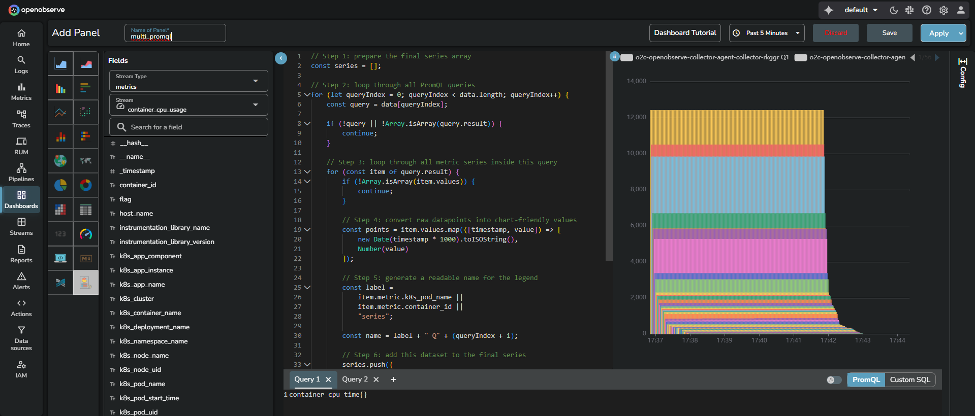
Each metric appears as a separate line in the chart.
You can toggle lines using the legend.
:::
:::accordion[How to extend this code for advanced visualizations]
### How to extend this code for advanced visualizations
The code in Step 3 already prepares a reusable `series` array:
- Each entry in `series` represents one metric time series
- Each entry has a `name`, `type`, and `data: [time, value]` points
You can reuse this same `series` array to build more advanced charts such as dual-axis visualizations, bar charts, scatter plots, and simple heatmaps.
**Dual-axis line chart**
A dual-axis chart is helpful when you want to compare two related metrics that have different scales.
For example, you may want to plot `container_cpu_time{}` on the left axis and `container_cpu_usage{}` on the right axis.
The following example assumes that:
- You have at least two PromQL queries in the panel
- The code from Step 3 has already run and populated the `series` array
Replace the `option = { ... }` block from Step 3 with the following code:
```js lineNumbers
// If available, map the first two series to separate Y axes
if (series.length >= 2) {
// First query on primary axis
series[0].yAxisIndex = 0;
// Second query on secondary axis
series[1].yAxisIndex = 1;
}
// Dual axis configuration
option = {
tooltip: { trigger: "axis" },
legend: { type: "scroll" },
xAxis: { type: "time" },
// Two vertical axes: one for each metric group
yAxis: [
{ type: "value", name: "Metric from Q1" },
{ type: "value", name: "Metric from Q2" }
],
series: series
};
```
The data transformation remains the same. Only the axis configuration changes and two series are assigned to different `yAxisIndex` values.
**Bar and scatter charts**
For bar or scatter charts, the structure of `series` can stay the same.
Only the `type` field needs to change.
In the Step 3 loop where the series objects are pushed, change this:
```js
type: "line",
```
to one of the following:
```js
type: "bar",
```
or
```js
type: "scatter",
```
The rest of the code, including the `points` transformation, remains identical because the chart still expects `[time, value]` points.
**Simple heatmap example**
Heatmaps require a different data structure.
Instead of `[time, value]` pairs, ECharts expects each point as `[xIndex, yIndex, value]`.
The following example converts the first series from Step 3 into a one-row heatmap. This is useful when you want to show intensity over time for a single metric.
```js lineNumbers
// Use the existing series from Step 3
if (!Array.isArray(series) || series.length === 0) {
option = {
xAxis: { type: "category", data: [] },
yAxis: { type: "category", data: [] },
series: []
};
} else {
const baseSeries = series[0];
// Extract time labels and values from the existing points
const timeLabels = baseSeries.data.map(([time]) => time);
// Convert into [xIndex, yIndex, value] for heatmap
const heatmapData = baseSeries.data.map(([time, value], index) => [
index, // xIndex over time
0, // yIndex single row
value // numeric intensity
]);
option = {
tooltip: { position: "top" },
xAxis: {
type: "category",
data: timeLabels,
name: "Time",
axisLabel: { show: false }
},
yAxis: {
type: "category",
data: ["Series 1"],
name: "Metric"
},
visualMap: {
min: Math.min(...heatmapData.map(p => p[2])),
max: Math.max(...heatmapData.map(p => p[2])),
calculable: true,
orient: "horizontal",
left: "center",
bottom: "5%"
},
series: [
{
name: baseSeries.name,
type: "heatmap",
data: heatmapData
}
]
};
}
```
This example:
- Reuses the same transformed `series[0].data` created in Step 3
- Maps each time point to an `xIndex`
- Uses a single row on the Y axis
- Uses `visualMap` to control the color scale
You can later extend this pattern to:
- Use one row per query or per label
- Group timestamps into buckets for coarser visualizations
The important point is that the initial transformation from PromQL remains the same.
You only reshape the transformed data to match what each chart type expects.
:::