

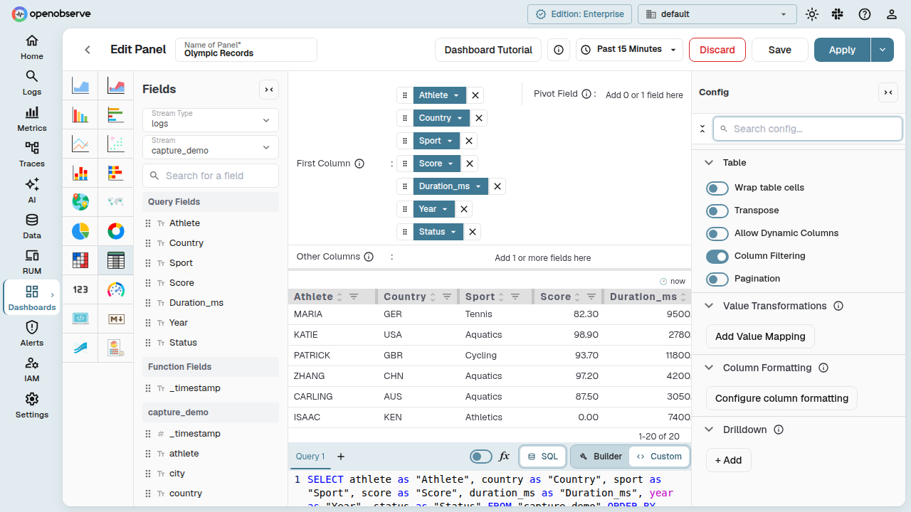
Table Chart
Table chart panels display query results as a tabular view, with support for per-column formatting, Excel-style column filtering, and pagination.
Configure column formatting
Column formatting lets you override the appearance of individual columns in a table panel — change value units, set text and background colors, control alignment, and define conditional styling rules.
To open the Column Formatting dialog:
- Open a dashboard panel with type Table.
- In the panel Config sidebar, locate the Field Overrides section.
- Click the Configure column formatting button.
Add a field
On first open, the dialog shows an empty state with an Add field button. Click it to see a dropdown of the panel's columns, each marked with a NUM or TEXT badge to indicate its detected data type.
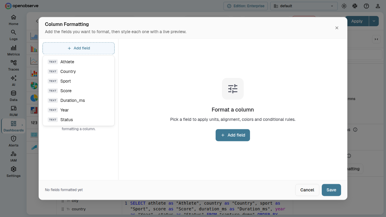
Select a column to add it to the formatting list. The dialog switches to a three-pane layout:
- Left pane — list of all fields you have added, with type badges and a hover-to-remove X button. Click a field to select it.
- Middle pane — formatting controls for the selected field.
- Right pane — a live preview of the column rendered with your current settings.
Formatting controls
The controls available for each field depend on its field type.
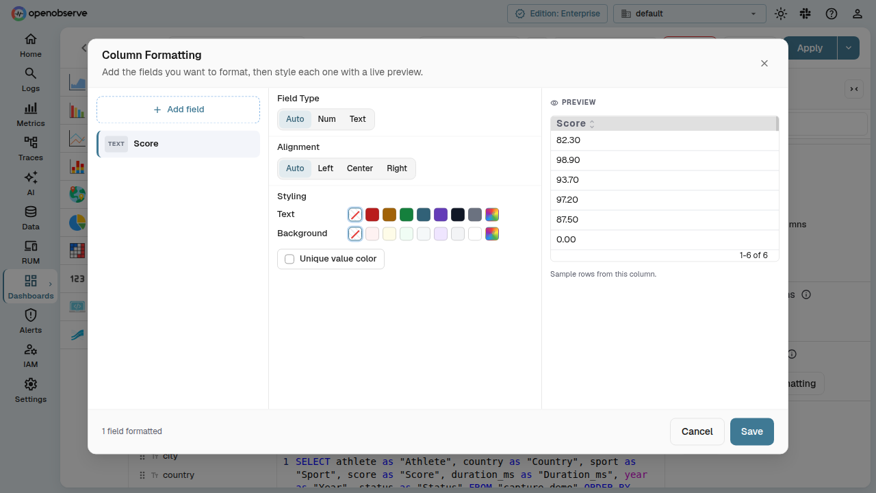
Field Type
Choose how the column's data type is interpreted:
- Auto — detect from the data (columns from Y-axis fields are numeric; X-axis and breakdown fields are text).
- Num — force numeric interpretation, enabling value formatting and conditional styling.
- Text — force text interpretation; value formatting and conditional styling are hidden.
Value Formatting
Available when the field type is numeric. Select a unit from the dropdown:
- Default — inherit the panel-level unit.
- Numbers — display raw numbers.
- Locale Format — use locale-aware number formatting.
- Bytes, Kilobytes, Megabytes — data size units.
- Bytes per Second — throughput.
- Seconds, Milliseconds, Microseconds, Nanoseconds — duration units.
- Percent (0-1), Percent (0-100) — percentage units.
- Currency (Dollar), Currency (Euro), Currency (Pound), Currency (Yen), Currency (Rupees) — currency units.
- Custom — enter a custom unit suffix.
When Custom is selected, a text input appears for the custom unit label.
Alignment
Set the column's text alignment:
- Auto — default alignment based on type (right for numeric, left for text).
- Left, Center, Right — explicit alignment.
Styling
- Text color — pick a color from the preset swatches, or use the rainbow picker for a custom color. The X button resets to no override.
- Background color — same swatch-based picker for the cell background.
- Unique value color — when enabled, each distinct value in the column gets a unique color from the chart palette, applied as the cell background.
Conditional Styling
Available when the field type is numeric. Define threshold rules that change cell colors based on the value.
Each rule reads as a sentence:
If value [operator] [threshold] then text color / background color.
Supported operators: <, >, <=, >=, =, !=.
Rules are evaluated in order; when multiple rules match a value, the last matching rule wins. This lets you layer conditions — for example, a rule for values > 400 (amber) followed by one for > 1000 (red) means values above 1000 will show red, not amber.
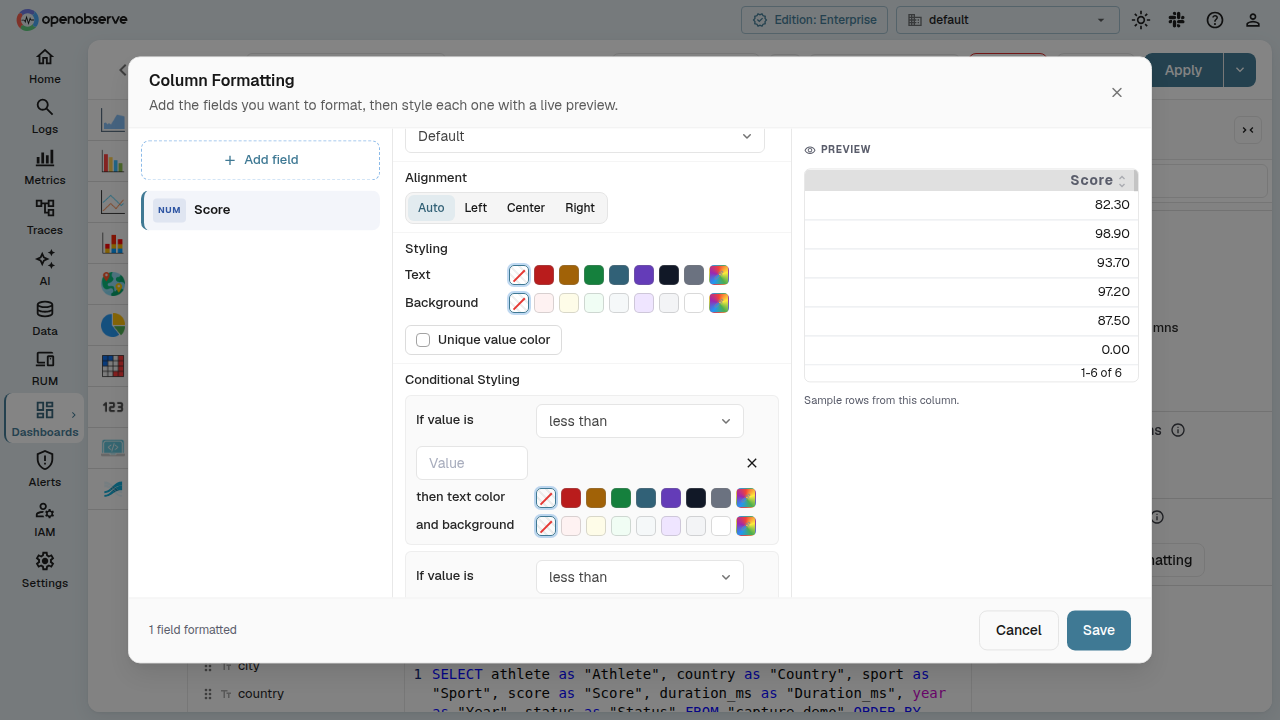
Click Add rule to create a new condition, or the X button on a rule to remove it.
Save or cancel
The dialog footer shows a count of configured fields. Click Save to apply the formatting or Cancel to discard changes.
Formatting settings are persisted with the dashboard and survive page reloads.
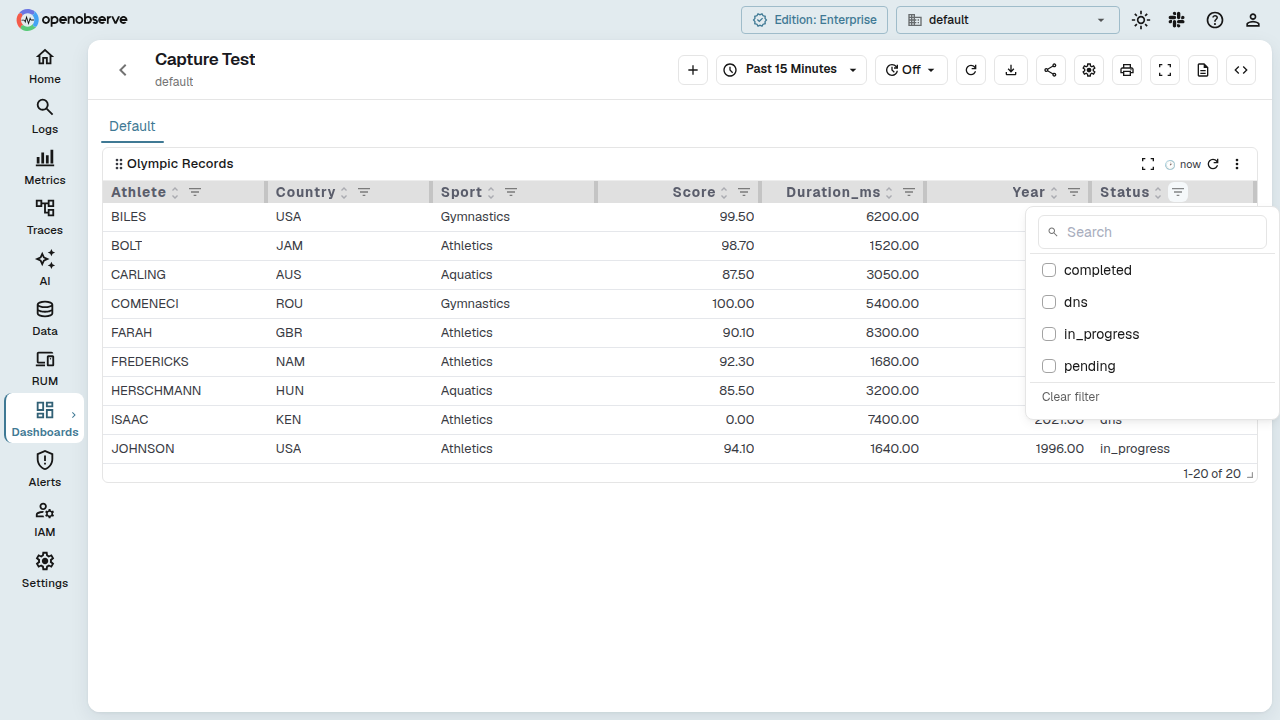
Column filtering
Column filtering provides Excel-style dropdowns in table column headers, letting you filter the visible rows by one or more distinct column values.
Enable column filtering
- Open a dashboard panel with type Table.
- In the panel Config sidebar, under the Table section, toggle Table Filtering.
Once enabled, a filter icon appears in each column header. Click it to open the filter panel for that column.
Use column filtering
The filter panel contains:
- Search — filter the list of unique values shown in the panel.
- Checkbox list — each distinct value in the column is listed as a checkbox. Check values to include in the table; only rows matching at least one checked value are shown.
- Clear filter — resets the selection and shows all rows.
When a column has an active filter, its filter icon turns blue to indicate the column is filtered. Filters are applied client-side and do not trigger a new query.
Configuration reference
The following panel config fields control table chart behavior:
| Field | Type | Default | Description |
|---|---|---|---|
table_filtering |
boolean | false |
Enables per-column filter dropdowns. |
table_pagination |
boolean | false |
Enables paginated mode (turns off virtual scroll). |
table_pagination_rows_per_page |
number | — | Rows per page when pagination is enabled. |
wrap_table_cells |
boolean | false |
Wraps long text in cells instead of truncating. |
table_transpose |
boolean | false |
Transposes the table (swap rows and columns). |
table_dynamic_columns |
boolean | false |
Shows only columns present in the data. |
override_config |
array | [] |
Per-column formatting rules (set via the Column Formatting dialog). |