


Insights: Interactive Dimension Analysis
Overview
Insights is an interactive dimension analysis feature that automates root cause identification by comparing anomaly periods against baseline data across multiple dimensions simultaneously.
What It Does
- Auto-selects relevant dimensions based on your data schema and telemetry standards
- Compares baseline vs selected periods with normalized metrics
- Ranks dimensions by impact to show which factors most explain changes
- Visualizes differences with interactive bar charts
When to Use
Use Insights for: - Visual exploration of dimension patterns - Hypothesis testing during incidents - Quick spot checks without waiting for AI analysis - Learning system behavior patterns
Supported Telemetry
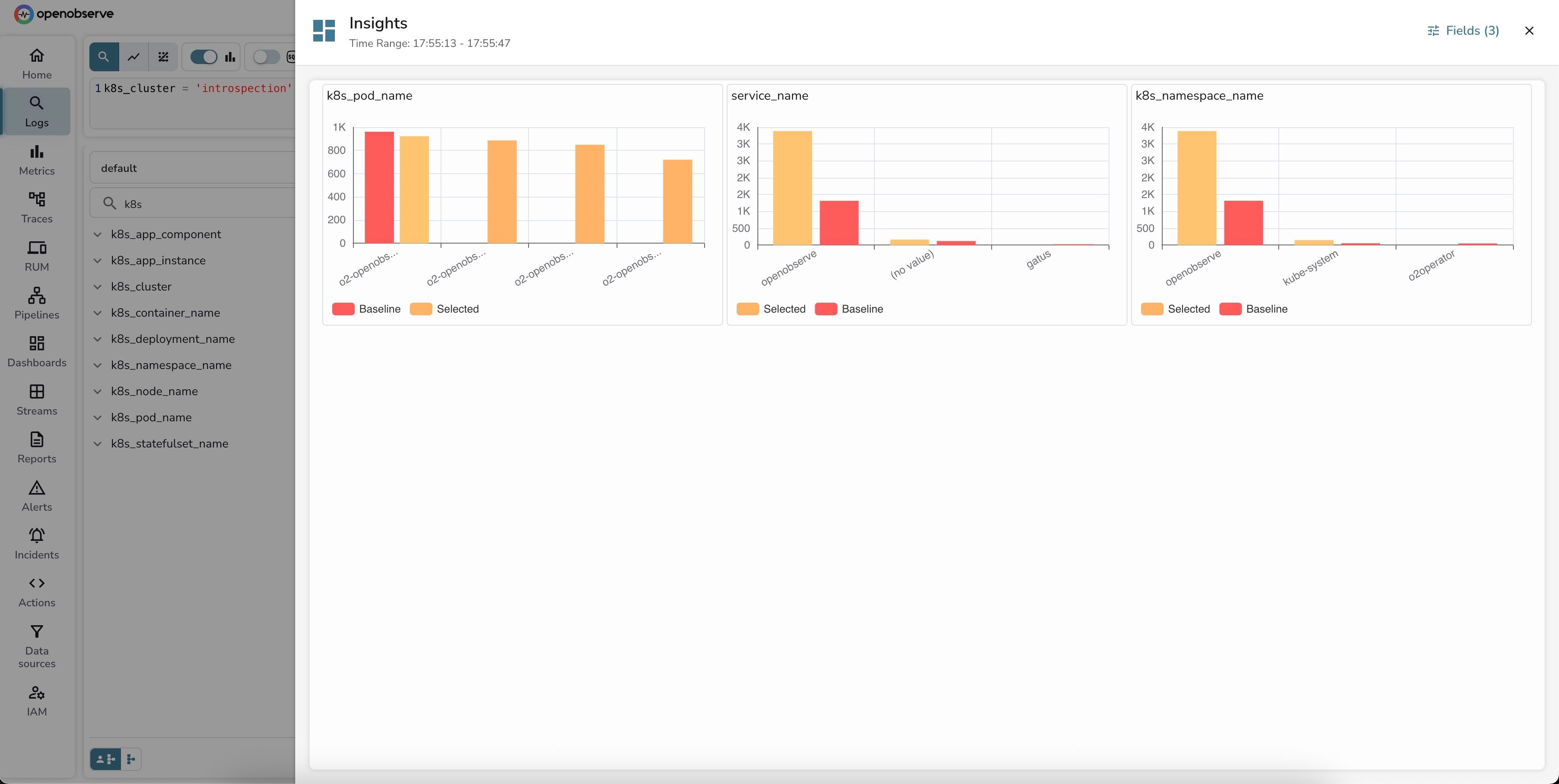
- Logs: Volume distribution analysis across dimensions
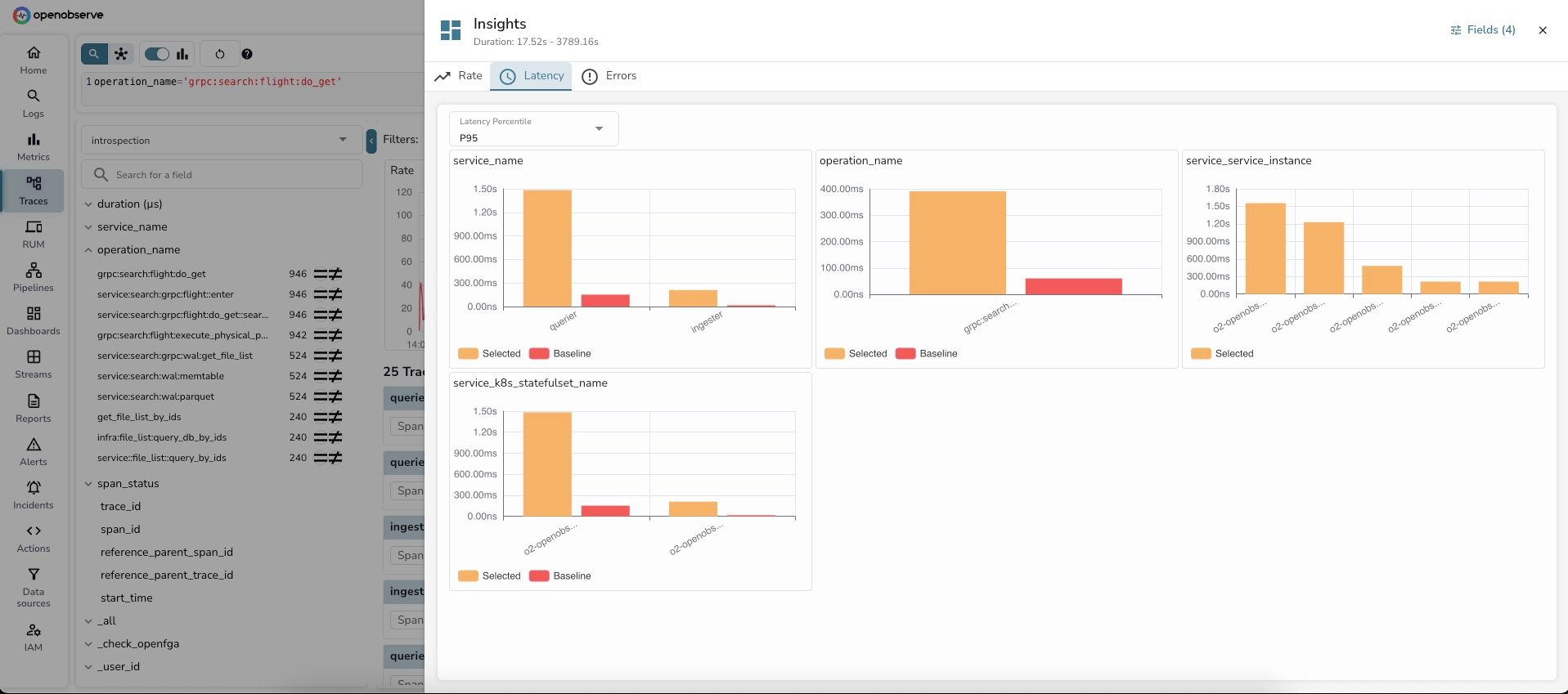
- Traces: Rate, latency (P50/P75/P95/P99), and error analysis
Key Terms
- Stream: Your data collection/index (e.g.,
default,prod-logs) - Baseline: Full search time range (e.g., "last 24 hours")
- Selected: Specific window you're investigating (e.g., "high-latency period")
- Dimension: Field used for grouping (e.g.,
service_name,pod_name) - Brush selection: Click-and-drag to select chart regions
- RED metrics: Rate, Errors, Duration - key observability metrics for traces
How to Use
For Log Analysis
- Run a log query (select stream, time range, optional filter)
 .
. - Click Insights button (top-right corner)
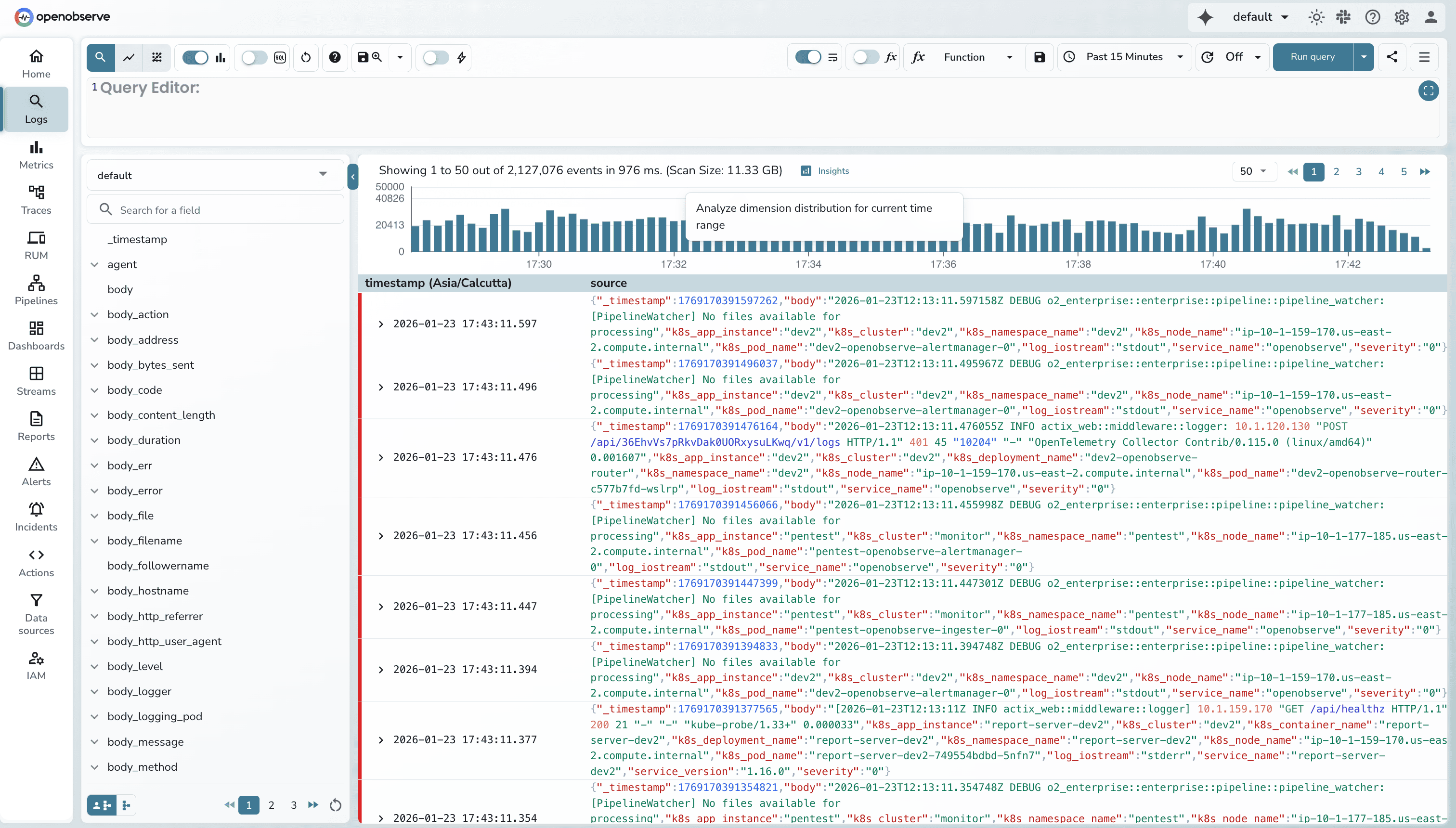
- Review dimension analysis dashboard
- (Optional) Customize dimensions via "Fields (X)" button
Example: Query k8s_cluster = 'production' shows which pods, services, and namespaces generate most logs.
For Trace Analysis
- Run a trace query (select stream, time range, optional filter)
- Observe RED metrics (Rate, Errors, Duration panels)
- (Optional) Make a brush selection:
- Drag vertically = Select latency range
- Drag horizontally = Select time range
- Drag diagonally = Select both
- Click Insights button
- Review analysis tabs: Rate, Latency, Errors
- (Optional) Adjust percentile in Latency tab
- (Optional) Customize dimensions via "Fields (X)" button
Example: Query operation_name='api/checkout' shows which services have highest latency during incidents.
Advanced Features
Percentile Adjustment (Traces)
- P50: Median user experience
- P75: Upper-middle tier
- P95: Worst 5% (common SLA target)
- P99: Tail latency (worst 1%)
Click refresh button after changing percentile.
Error-Only Mode (Traces)
Enable "Error Only" toggle to restrict analysis to error traces only.
Dimension Customization
Click "Fields (X)" button to: - Add/remove dimensions - Search for specific fields - Optimal cardinality: 2-50 unique values
Filter Management
- Each brush selection creates a removable filter chip
- Click X on chips to clear individual filters
Troubleshooting
Insights button not appearing - Ensure search results are loaded (> 0 results) - Click "Run query" first
No dimensions shown - Click "Fields (X)" and manually select dimensions
Brush selection not working - Click and hold, drag across chart, then release
Wrong latency values - Verify percentile dropdown setting (P50/P75/P95/P99)
Additional Resources
- Detailed guide with examples: From Symptoms to Quick Insights blog post
- Logs guide: Logs documentation
- Traces guide: Traces documentation
- Alerts setup: Alerts documentation
Getting Help
- Community: Slack
- GitHub Issues: Report bugs