Dashboards and Visualizations
Gain valuable insights and identify patterns from your observability data with real-time, customizable dashboards.
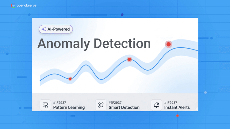
Spot Issues Before Users Do
Identify potential problems before they impact your users.
Resolve Issues Faster
Pinpoint exact issue sources for quicker, more accurate fixes.
Collaborate Effectively
Monitor systems from a single source of truth for complete visibility.
OpenObserve Dashboards and Visualizations
Real-Time Monitoring
Interactive Dashboards
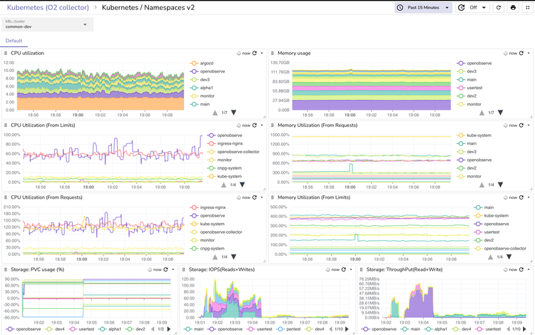
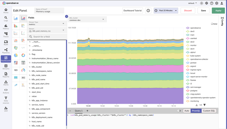
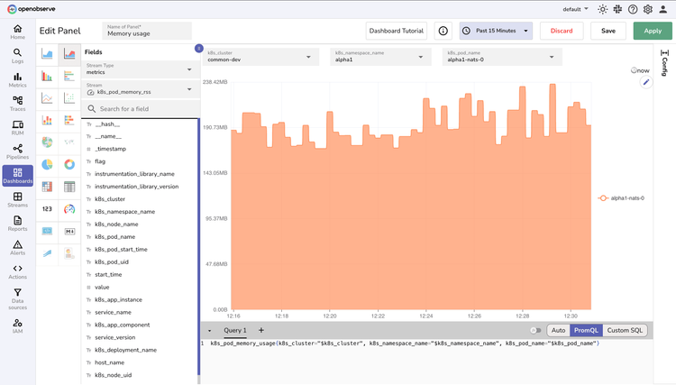
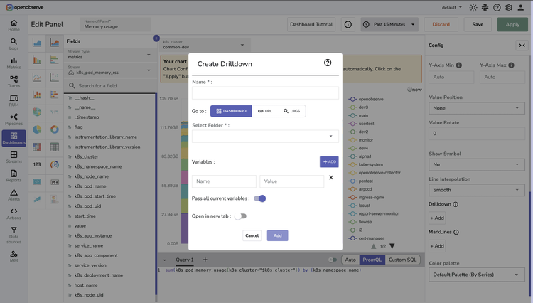
Visualize your system's heartbeat with 19+ chart types—from heat maps that expose hotspots to time-series graphs that reveal trends. Build comprehensive health views in minutes with intuitive drag-and-drop simplicity.
Continuous Updates
Stay perpetually informed with live data streams that keep you ahead of developing issues. Fine-tune refresh rates for each dashboard or panel to match your critical monitoring needs.

Dashboards and Visualizations FAQs
Latest From Our Blogs


Ready to get started?
Try OpenObserve today for more efficient and performant observability.