How to Build Metrics Dashboards for SRE & DevOps Teams

Simran Kumari
October 02, 2025
11 min read
Don’t forget to share!
Try OpenObserve Cloud today for more efficient and performant observability.
When you’re on-call as an SRE or running ops for your team, dashboards are your cockpit. They’re where you go first when someone pings “is something wrong?”
The seven types of dashboards we’ll cover include:
The right dashboard answers the right questions quickly. Is the build pipeline healthy? Did that deployment succeed? Are containers and hosts running out of resources? Is the cluster stable?
Let’s walk through the most common systems you’ll need to monitor. For each dashboard type, we’ll cover:
Note: A link to a prebuilt JSON dashboard that you can import right away is included for each of the seven dashboards covered.
If you’re new to building dashboards, start with our Observability Dashboards primer.
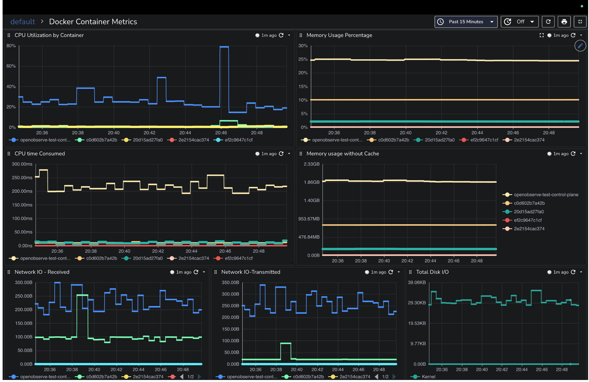
When a service slows down or fails, one of the first places to check is the containers running it. Containers form the backbone of modern deployments, and if they are starved for CPU, memory, or I/O, the issues quickly ripple through your applications. You might see pods restarting, requests timing out, or services becoming sluggish symptoms that often look like application bugs but are actually resource-related.
A Docker dashboard helps you identify these issues immediately. It should give you a clear view of which containers are healthy, which are under stress, and where bottlenecks may be forming.
You should focus on the metrics that reveal resource pressure: CPU usage, memory usage, disk I/O, and network throughput. These metrics help answer questions such as:
CPU Utilization by Container (line graph): Shows CPU usage % for each container to spot high consumers.
CPU Time Consumed (rate): Tracks CPU nanoseconds consumed, useful for workload intensity over time.
Memory Usage % (line graph): Highlights containers under memory pressure.
Memory Usage without Cache: Helps detect memory leaks or excessive growth.
Network I/O – Received / Transmitted (line graphs): Spot containers saturating inbound or outbound network traffic.
Disk I/O (read/write bytes per container): Identify containers causing storage bottlenecks.
By combining these panels, you can monitor container health in real time, detect potential problems before they impact users, and make informed decisions on resource allocation.
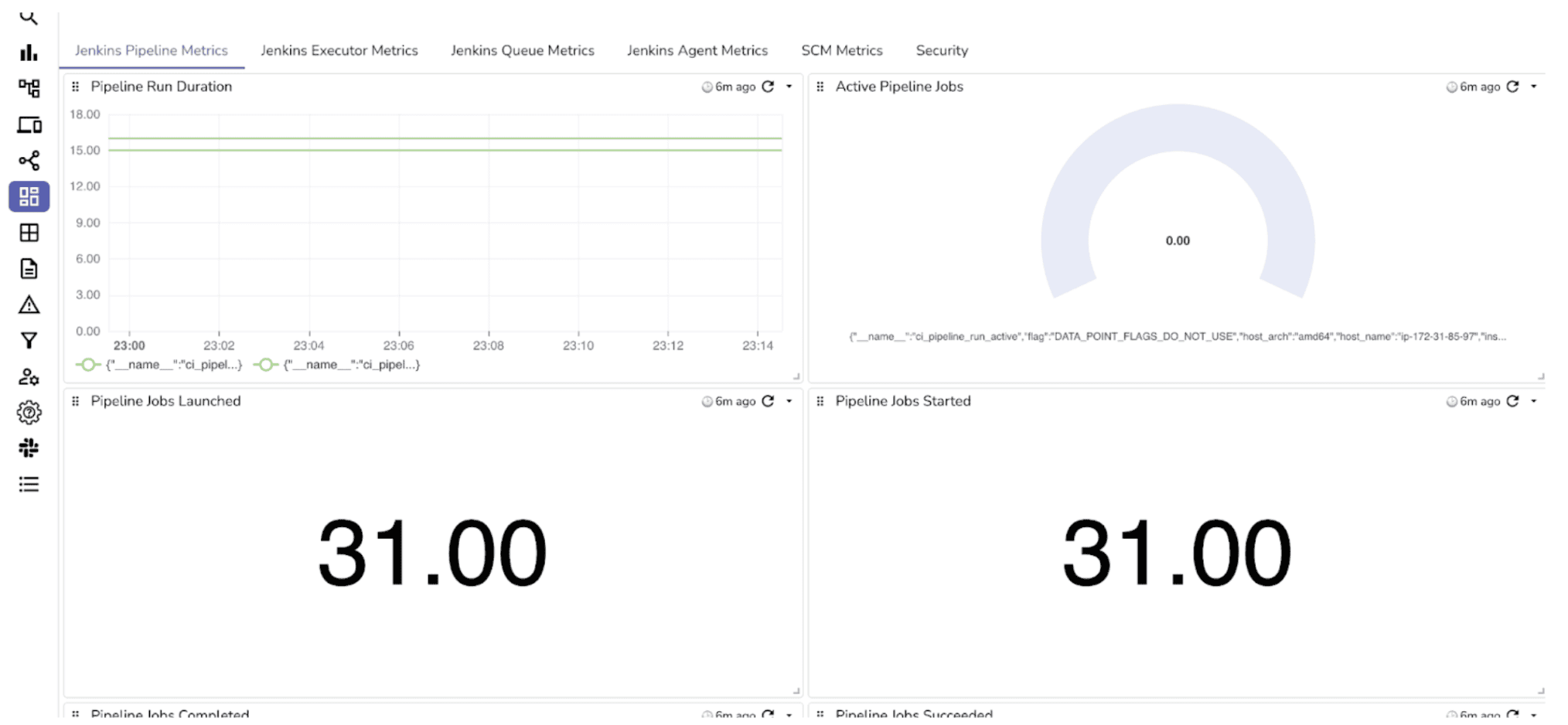
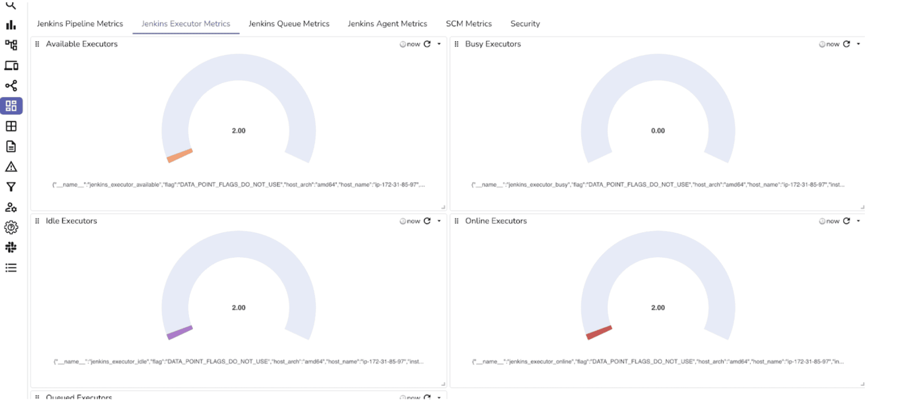
CI/CD pipelines are the engines of modern software delivery. When builds fail or slow down, it impacts deployments, releases, and ultimately your users. You need a dashboard that tells you at a glance which jobs are healthy, which are failing, and where the bottlenecks are in your build pipeline.
A well-built Jenkins dashboard helps you answer questions like:
By keeping these panels visible, you can react quickly to failing jobs, balance executor resources, and prevent slowdowns in your CI/CD process.
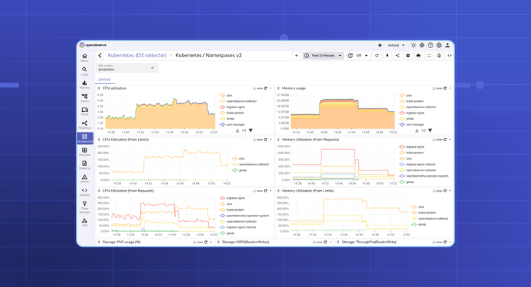
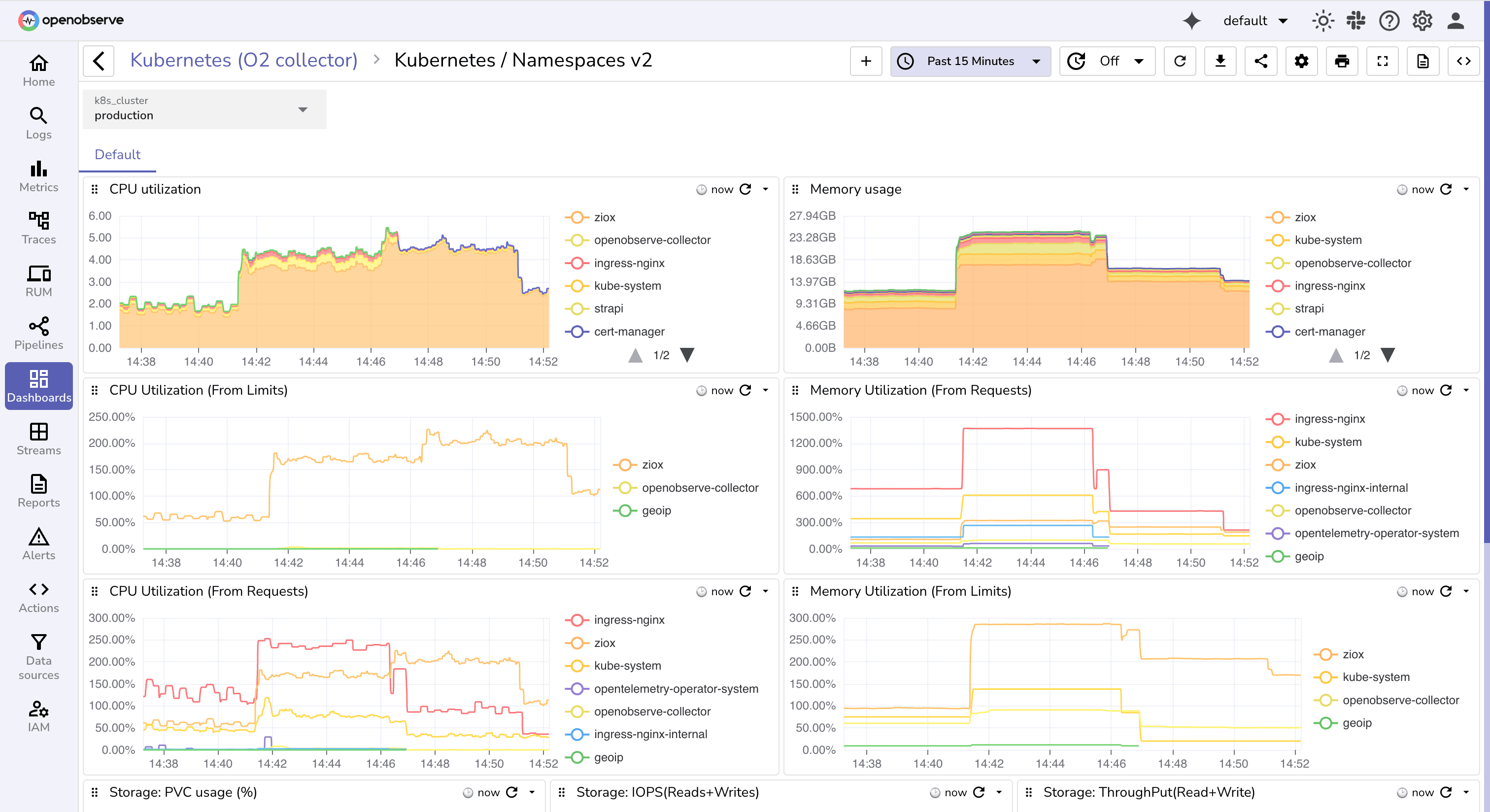
When managing a Kubernetes cluster, ensuring the health of nodes, namespaces, and pods is critical. Kubernetes orchestrates containerized workloads, and if resources such as CPU, memory, or storage become constrained, the impact quickly cascades across applications and services. Symptoms like pod restarts, slow response times, or failed deployments are often caused by underlying resource issues.
A Kubernetes dashboard helps you visualize these problems in real time. It should give you visibility across cluster layers from nodes and namespaces down to individual pods and events, so you can detect bottlenecks early and keep workloads stable.
You should focus on metrics that reflect cluster health and workload stability, such as CPU and memory usage, pod restarts, scheduling failures, and node pressure conditions. These metrics help answer questions like:
By combining these panels, you can monitor Kubernetes health across all layers, detect issues early, and ensure that workloads are running smoothly and efficiently.
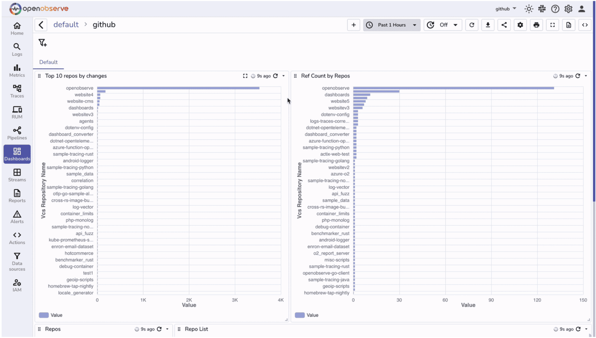
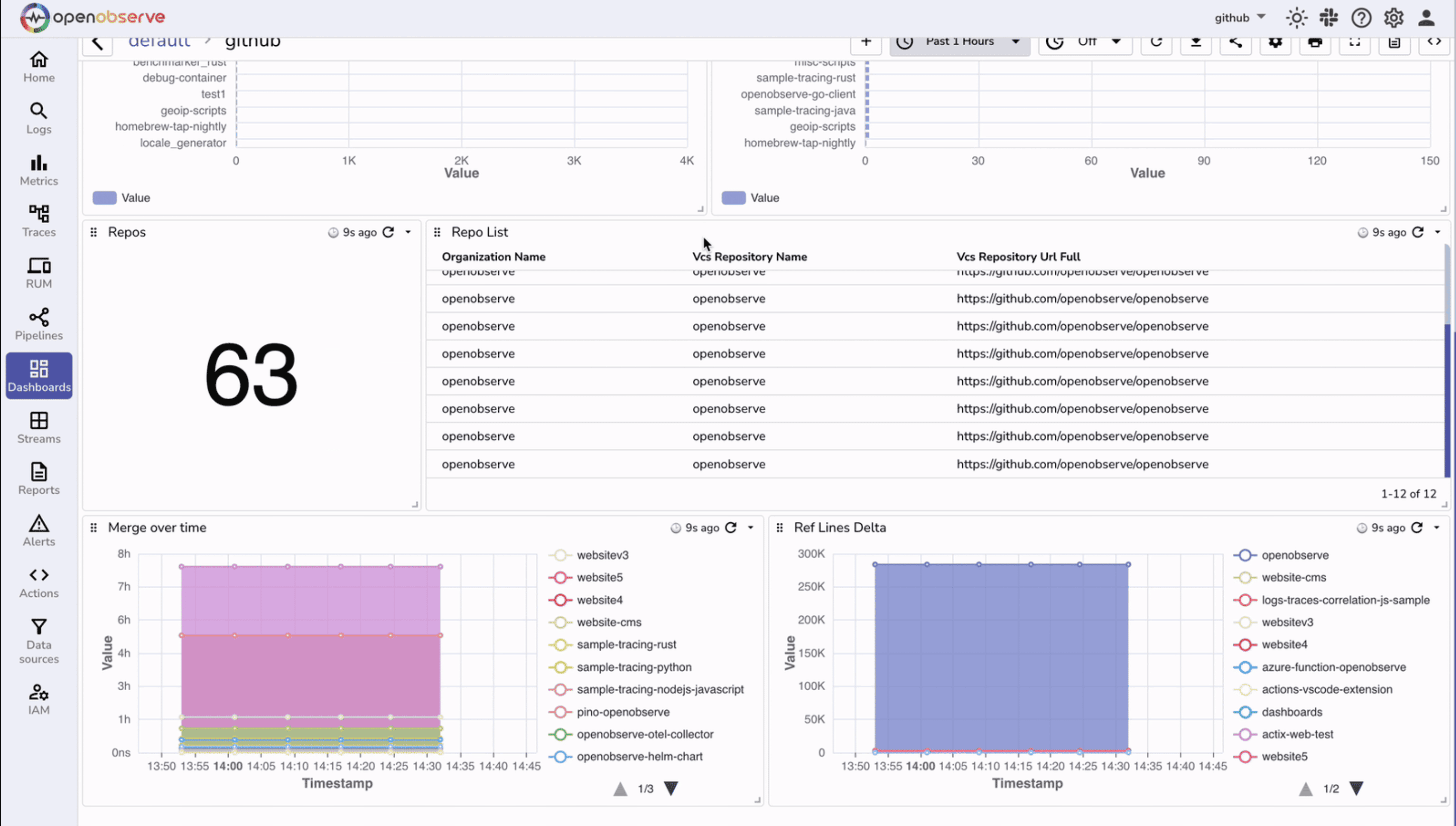
Repositories are the source of truth for your codebase, and monitoring their activity helps maintain healthy development workflows. Issues like stalled merges, inactive repositories, or sudden spikes in changes can slow down productivity even if builds aren’t failing.
A GitHub dashboard helps you visualize repository-level activity, track contribution patterns, and detect bottlenecks early. It provides visibility into merges, references, and overall repository health so you can ensure smooth collaboration across teams.
You should focus on metrics that reveal repository activity and efficiency: repository counts, change frequency, merge times, and reference activity. These metrics help answer questions such as:
By combining these panels, you can monitor GitHub repository health in real time, detect potential process or collaboration issues, and make informed decisions to improve your team’s development workflow.
Continuous delivery pipelines rely on Argo CD to ensure that the desired state of your Kubernetes clusters matches what’s declared in Git. When deployments drift or applications degrade, it can directly impact availability.
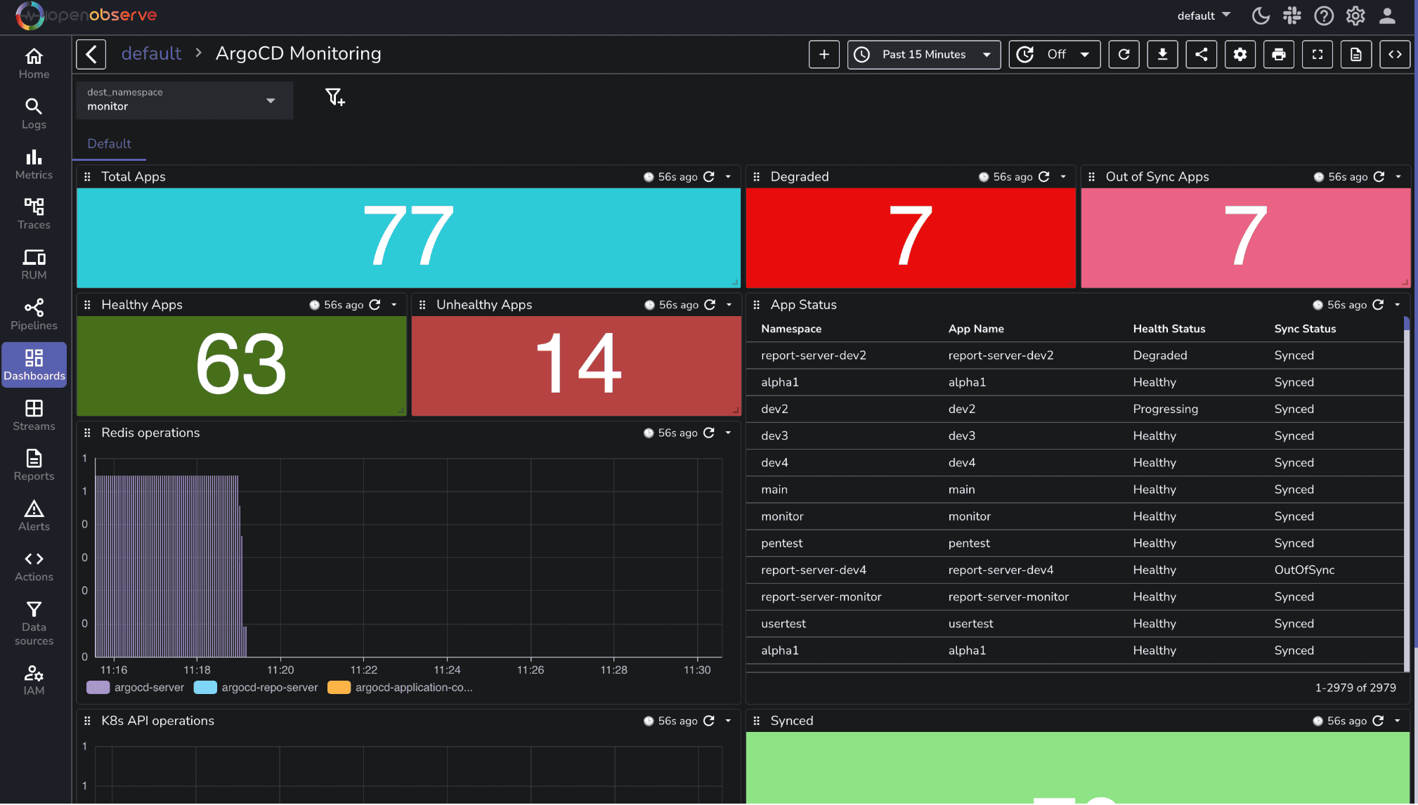
An Argo CD dashboard gives immediate insight into application health, synchronization status, and overall stability. It shows which applications are healthy, degraded, or out of sync, and provides a detailed view of each app.
Focus on metrics that reveal deployment and cluster health: application sync status, health checks, and problem detection. These metrics help answer questions such as:
Application Health Overview (stat panels): Quickly see the number of healthy, degraded, or out-of-sync applications (Total Apps, Healthy Apps, Unhealthy Apps, Degraded Apps, Out of Sync Apps, Synced Apps).
App Status (table): Track the sync and health status per application including namespace, name, health, and sync state.
Redis Operations (bar chart): Monitor Argo CD Redis request activity by initiator to spot operational bottlenecks.
K8s API Operations (line chart): Track Kubernetes API request rates by resource kind to identify spikes or unusual activity.
Prometheus powers your monitoring stack, but even Prometheus itself needs monitoring. If the Prometheus server is down, scraping targets fail, or alert rules are misconfigured, you won’t see critical metrics leaving your observability blind.
The OpenObserve Prometheus dashboard lets you monitor the Prometheus server directly. It provides real-time visibility into server health, scrape performance, rule evaluations, and storage usage, ensuring that your monitoring pipeline is reliable.
Focus on metrics that reveal the Prometheus server’s health and reliability:
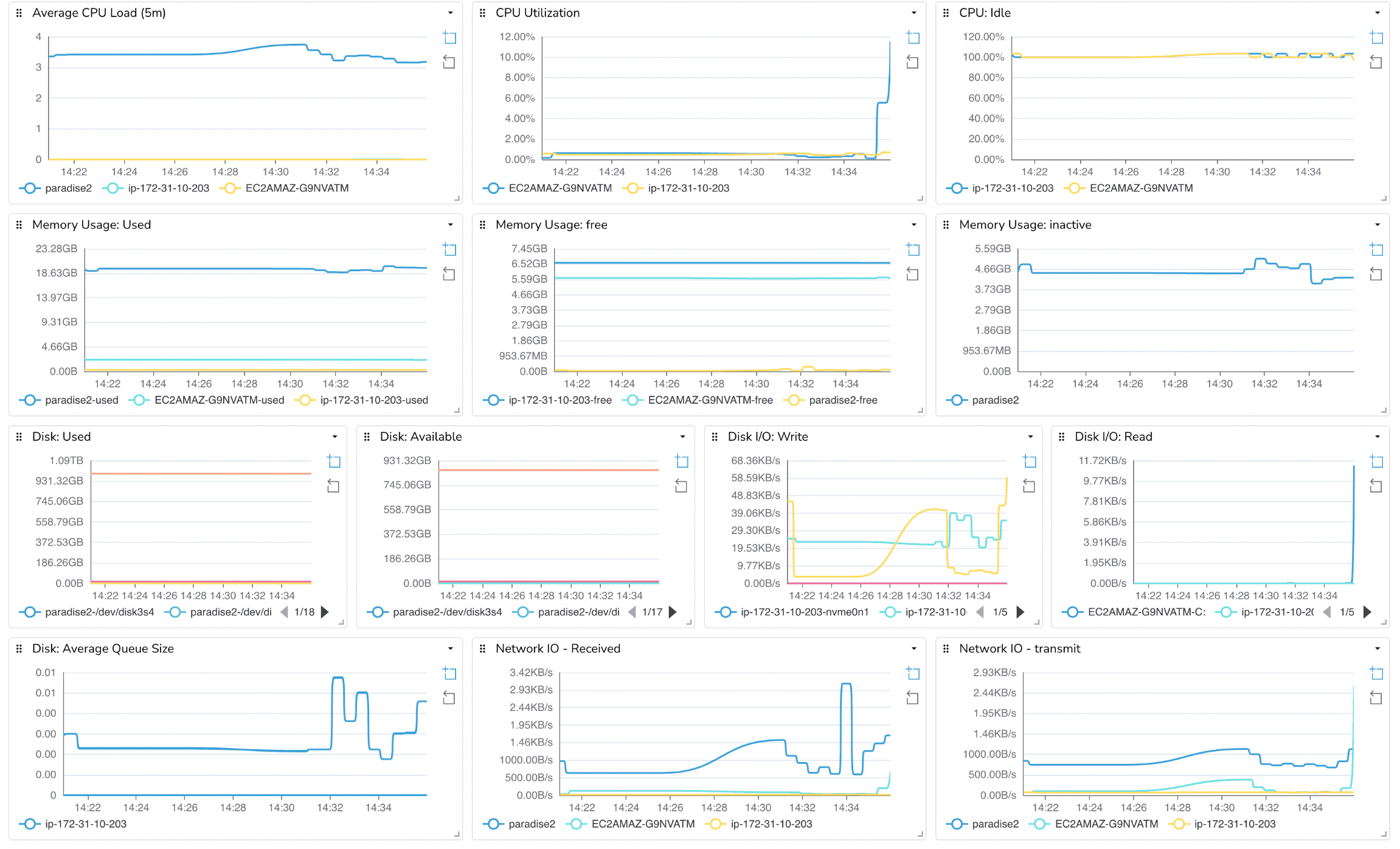
Even with containers, Kubernetes, and CI/CD pipelines, the foundation of your infrastructure is the host itself. CPU spikes, memory pressure, disk saturation, or network congestion at the host level can cause cascading failures across all your services. Monitoring hosts ensures you catch these issues before they affect applications.
The Host Metrics dashboard provides visibility into the health and resource usage of your servers or VMs. It helps you answer questions such as:
By monitoring hosts alongside containers, applications, and Prometheus, you gain a full-stack view of your environment. This ensures that resource issues at the infrastructure level don’t go unnoticed and provides early warning before they impact users.
Dashboards are the central tool for SREs, DevOps engineers, and developers to maintain system health, detect issues early, and make data-driven decisions. By combining prebuilt dashboards for Docker, Kubernetes, Jenkins, GitHub, Argo CD, Prometheus, and host metrics, you get full-stack visibility across applications, infrastructure, and CI/CD pipelines.
Ready to put this into practice? Sign up for an OpenObserve cloud account (14 day free trial) or visit our downloads page to self host OpenObserve.
Passionate about observability, AI systems, and cloud-native tools. All in on DevOps and improving the developer experience.