Observability Dashboards: What to Show and How to Build Them

Simran Kumari
September 25, 2025
10 min read
Don’t forget to share!
Try OpenObserve Cloud today for more efficient and performant observability.
Get Started For Free
In modern cloud-native environments, teams run distributed microservices across Kubernetes clusters, serverless functions, and managed infrastructure. While this improves scalability, it also adds complexity.
When something goes wrong, you can’t simply log into a single machine you need to quickly answer:
Observability dashboards are the bridge between raw telemetry and action. They allow engineers to:
Dashboards are often the first stop during an incident. Done well, they help on-call engineers answer “is the system healthy?” in seconds and drill into root causes without drowning in noise. Done poorly, they become cluttered wall art nobody trusts.
This guide shows what dashboards actually matter, which KPIs to plot, design patterns that reduce MTTR, and how to build them step-by-step in OpenObserve using real SQL queries.
| Dashboard | Primary audience | What it answers | KPIs / panels to include |
|---|---|---|---|
| Service health (golden signals) | SRE, on-call | “Is the user journey healthy right now?” | Request rate, error rate, p95/p99 latency, saturation (CPU/mem), % good events |
| Incident triage | SRE, DevOps | “What changed and where?” | Recent deploys, error bursts by service/version, top log patterns, hot endpoints, trace exemplars |
| Backend & infra | Platform | “Do we have capacity and headroom?” | Node/Pod health, throttling, restarts, disk/IO, queue depth, GC, network egress |
| Ingest quality | Observability owners | “Is telemetry complete and parseable?” | Ingest GB/day, dropped events, parsing errors, pipeline cost, stream cardinality |
| Cost & retention | Eng mgmt, FinOps | “What’s our spend driver?” | Ingest by team/namespace, query GB, top expensive queries, retention by stream |
Start with service health + incident triage. Add ingest/cost once you’ve run for a week and see patterns.
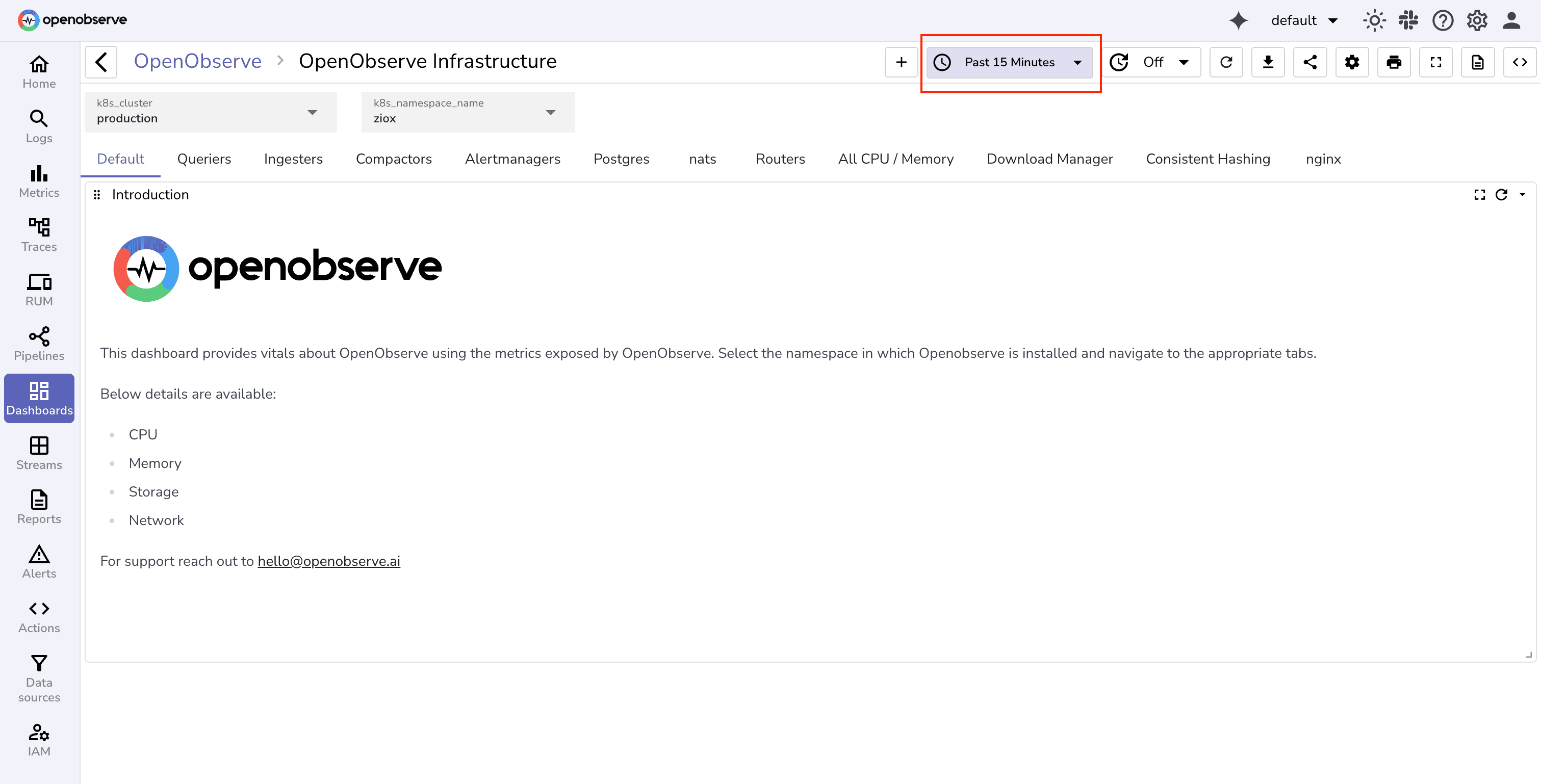
If you’re new to dashboards in OpenObserve, start with the official guide on creating dashboards. It walks through the basics of building panels, setting time ranges, and customizing layouts.
Once you’ve covered the basics, the next section dives into practical patterns, SQL queries, and variables you can use to build production-ready dashboards for SRE, DevOps, and platform teams.
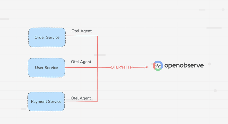
Assumes you’re already sending logs/metrics/traces to OpenObserve. If not, dual-write from Fluent Bit/OTel Collector for a week, then cut over.
Variables let dashboards be reusable across teams, services, and environments. Typical examples:
These variables power the drop-downs so the same dashboard can serve multiple teams.
Below are starter queries you can copy, adapt, and turn into panels. Each example answers a real on-call question.
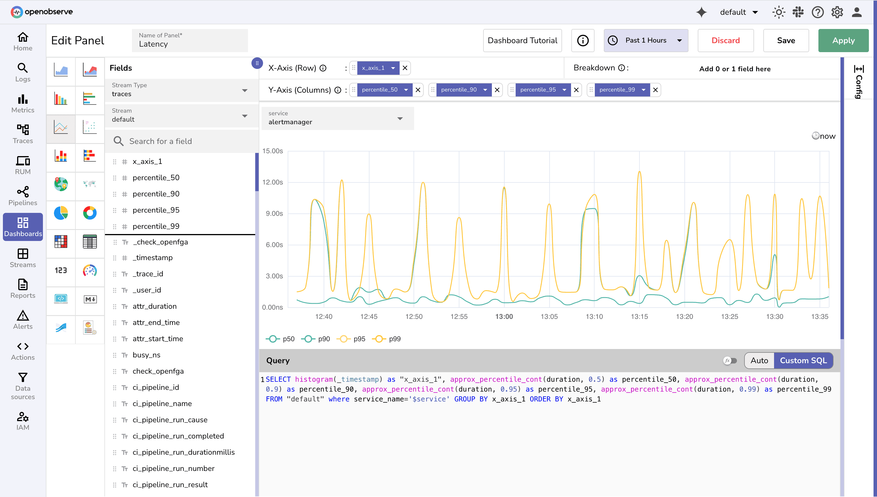
1. Service Health (Golden Signals)
SELECT histogram(_timestamp, '5m') AS ts,
       countIf(status_code >= 500) * 100.0 / count(*) AS error_rate
FROM default
WHERE service_name = '${Service}' AND environment = '${Environment}' AND event_type = 'http_request'
GROUP BY ts
ORDER BY ts
SELECT histogram(_timestamp, '5m') AS ts,
       approx_percentile(root_duration_ms, 0.95) AS p95_latency
FROM traces
WHERE service_name = '${Service}' AND environment = '${Environment}'
GROUP BY ts
ORDER BY ts
2. Incident Triage
SELECT histogram(_timestamp, '5m') AS ts,
       service_name,
       version,
       countIf(status_code >= 500) AS error_count
FROM logs
WHERE environment = '${Environment}'
GROUP BY ts, service_name, version
ORDER BY ts
SELECT endpoint, count(*) AS failures
FROM traces
WHERE status_code >= 500
  AND environment = '${Environment}'
AND span.kind='server' AND span.name = '/'
GROUP BY endpoint
ORDER BY failures DESC
LIMIT 10
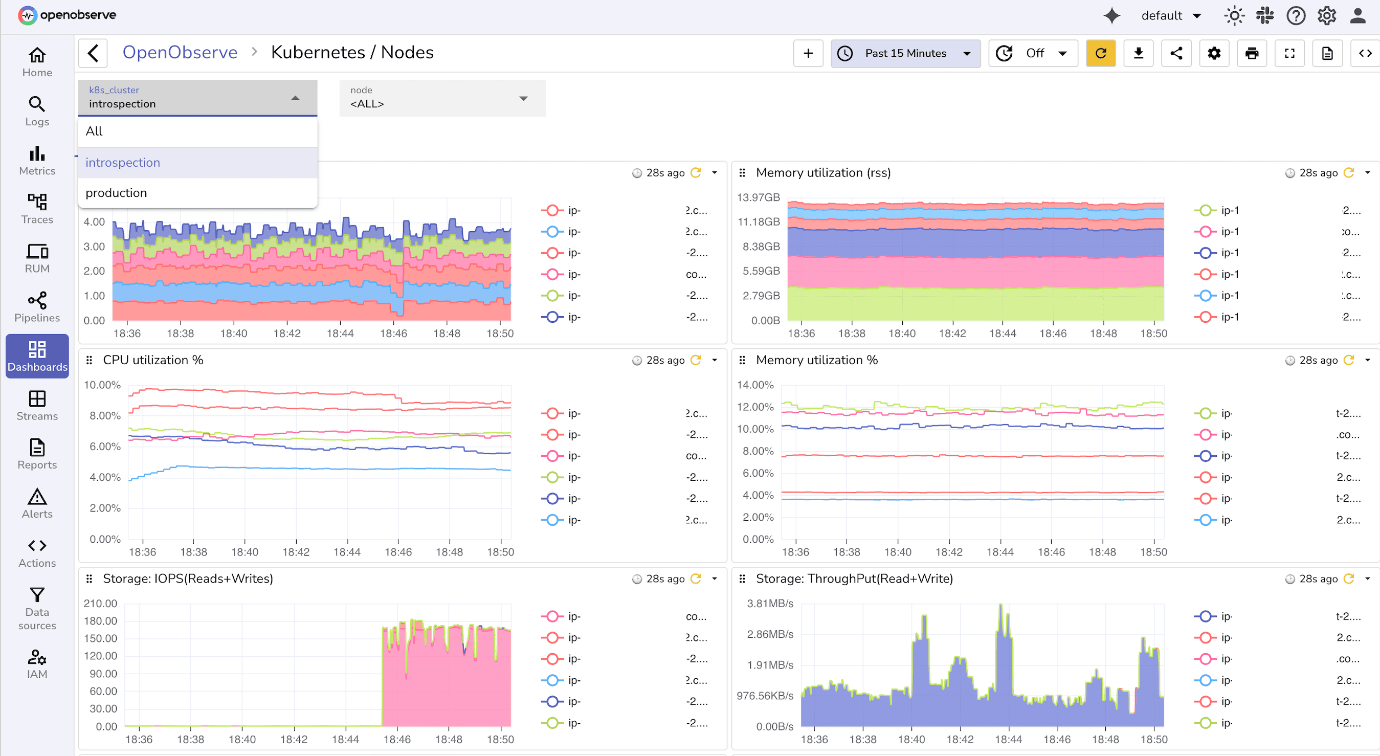
3. Backend & Infra
SELECT histogram(_timestamp, '5m') AS ts,
       pod_name,
       max(restart_count) AS restarts
FROM kube_pod_metrics
WHERE namespace = '${Namespace}'
GROUP BY ts, pod_name
ORDER BY ts
SELECT histogram(_timestamp, '5m') AS ts,
       avg(cpu_usage) AS cpu,
       avg(memory_usage) AS mem
FROM kube_node_metrics
WHERE cluster = '${Cluster}'
GROUP BY ts
ORDER BY ts
4. Ingest Quality
SELECT histogram(_timestamp, '5m') AS ts,
       countIf(parse_error = true) AS parsing_errors
FROM ingest_logs
WHERE environment = '${Environment}'
GROUP BY ts
ORDER BY ts
SELECT count(DISTINCT user_id) AS unique_users
FROM logs ; -- say for past 1 hr
5. Cost & Retention
SELECT namespace,
       round(sum(bytes_ingested)/1024/1024/1024, 2) AS gb_ingested
FROM ingest_logs
GROUP BY namespace
ORDER BY gb_ingested DESC
-- say for past 24 hrs
Each query becomes a dashboard panel. Use variables (${Service}, ${Environment}, ${Namespace}) to make them reusable across teams.
service, version, k8s.namespace. 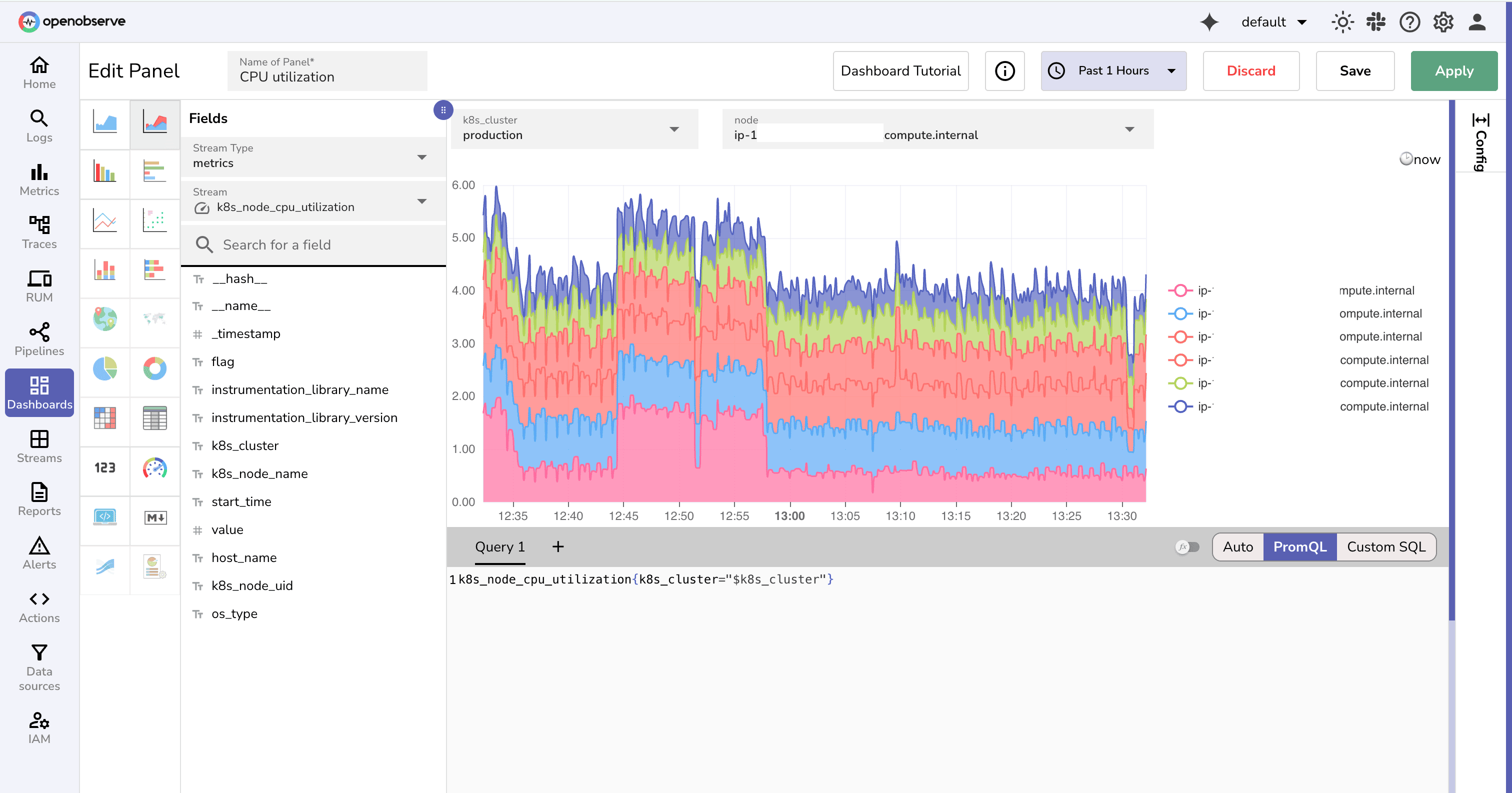
Most teams drown in noisy alerts. The ones that matter are the ones tied directly to user impact or to the reliability of your observability pipeline. Start with these:
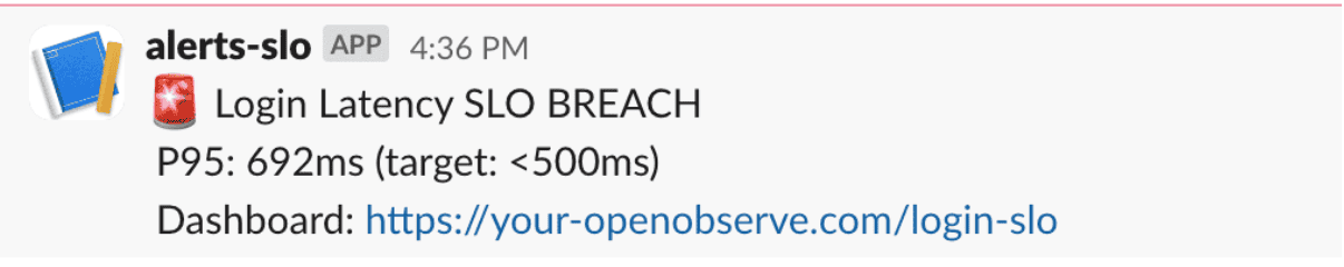
Page on-call when the 5-minute burn rate for a 2-hour SLO exceeds 2× (fast-burn).
Open a ticket when the 1-hour burn rate stays above 1× (slow-burn).
Learn how to set up SLO-based alerts in OpenObserve
level:error and the time window. 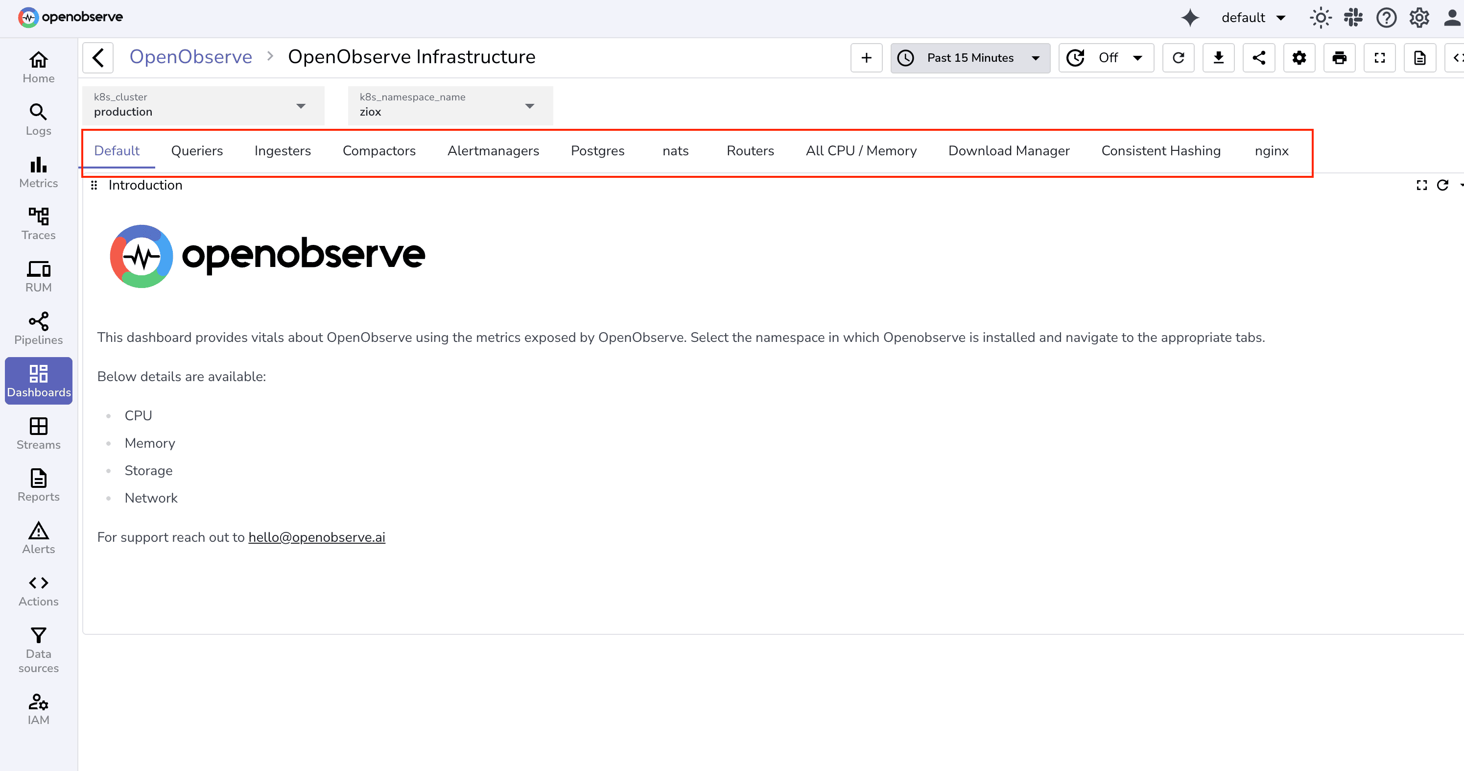
env, service, namespace. service, status, duration_ms, trace_id exist and are typed correctly. If you’re setting this up today, begin small: stream one service into OpenObserve, create a Service Health dashboard, and add an Incident Triage view. Create panels, add variables and filters. You can also create Custom charts.
Once those are solid, expand into ingest quality and cost. That foundation will keep your observability useful instead of noisy wall art.
Next, you can tie dashboards to actionable burn-rate alerts and user-impact metrics. Read our SLO alerting guide.
Ready to put these principles into practice?
Sign up for an OpenObserve cloud account (14-day free trial) or visit our downloads page to self-host OpenObserve.
Most SRE dashboards focus on golden signals: request rate, error rate, latency (p95/p99), and saturation (CPU, memory, queue depth). For incidents, add deployment markers, top log patterns, and trace exemplars. Start with service health and incident triage panels, then layer on cost and ingest quality metrics.
Use variables and filters like service, environment, and namespace in your queries. This enables one dashboard template to work for multiple teams or deployments. Drop-downs or filter widgets in OpenObserve allow easy switching between contexts.
Monitor ingest quality metrics, such as:
Alerts on silent streams or elevated parsing errors help catch broken telemetry before dashboards go dark.
Burn rate measures how fast you’re consuming your error budget:
burn_rate = (observed_bad_fraction) / (error_budget * (alert_window / slo_window))
Where observed_bad_fraction = bad_count / total_count in the alert window. Use this to trigger on-call paging for fast burns and tickets for slower trends. Include SLO targets and time windows in dashboards for clarity.
env, service, namespace). Weekly or bi-weekly reviews help prune unused panels, recalibrate alert thresholds, and keep dashboards aligned with evolving production systems.
Passionate about observability, AI systems, and cloud-native tools. All in on DevOps and improving the developer experience.