We Built OpenObserve for Speed. Then We Fixed the UX.




Ready to get started?
Try OpenObserve Cloud today for more efficient and performant observability.
TL;DR
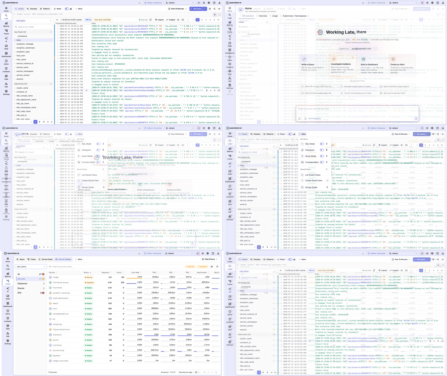
For most of OpenObserve's life we optimized for two things: how fast it runs and how little it costs to run. The user experience took a backseat, and that is the honest starting point of this OpenObserve UX story. Optimizing for speed and cost was a deliberate choice, and it was the right one for the problem we set out to solve. It also had a cost we did not talk about enough: the interface lagged the engine. You told us so, clearly and repeatedly. The v0.91.0 release was our turn to act on it, an observability UI redesign that touched nearly every screen in the product. We did it without giving up the speed we are known for. And we are not finished.
The bet we made early: speed and cost over UX
When we started OpenObserve, the observability tools people used were fast to click through and brutally expensive to run at scale. Storage costs ballooned, ingestion pipelines fell over, and teams ended up rationing what they could afford to observe. So we made a bet: get the engine right first. Optimize it so hard that storing enormous volumes of logs, traces, and metrics becomes genuinely cost-effective, and make queries fast over that data. If we nailed that, we would earn the right to be someone's observability platform.
We do not regret the bet. The performance and cost story is why a lot of you are here. But bets have a price, and ours was this: the person tuning the storage engine is not the same person sweating over whether a field list is easy to scan or whether the dark theme actually looks good at 11pm during an incident. For a long time, the engine won that competition for our attention almost every time. The product got faster and more cost-effective, and the experience of using it did not keep pace.
The UX feedback we could not unhear
Here is the uncomfortable part. Users noticed, and users said so.
The message came in many forms and from many people, but it rounded to the same thing: the platform was powerful and quick, and using it was harder than it needed to be. A left nav of bare icons you had to decode from memory. A logs page that dropped you into a wall of raw source instead of the message you came to read. Field lists that ran long with nowhere to collapse them. Screens that felt dense, and jumps between them that took more steps than they should. None of it was a dealbreaker on its own, and all of it together was real friction that we had let accumulate while we were looking at benchmarks.
We could have explained it away. Performance is genuinely hard, our team was genuinely stretched, the tradeoff was genuinely reasoned. All true, and none of it changes the experience of the person on the other side of the screen. So instead of defending the tradeoff, we decided to fix it.
The turn: the v0.91.0 observability UI redesign
v0.91.0 is where the correction landed. It was not a new theme dropped over the old product. It was a sustained campaign across the interface, dozens of changes over months, and it reached logs, traces, metrics, dashboards, alerts, pipelines, and the home screen. A few of the areas we rebuilt:
Navigation and layout. We rebuilt the left navigation from the ground up, and the change most of you will notice first is a small one that matters a lot: those bare icons now come paired with text labels, organized into groups. An icon-only rail looks clean in a mockup and quietly taxes you every day, because you are always translating a glyph back into "was that traces or metrics?" Pairing every icon with its label removes that guesswork. Alongside it we refactored the main layout and reworked the header, so moving through the product takes fewer detours. This was iterative rather than a single dramatic ship, a series of layout passes that together add up to a calmer, more predictable structure.
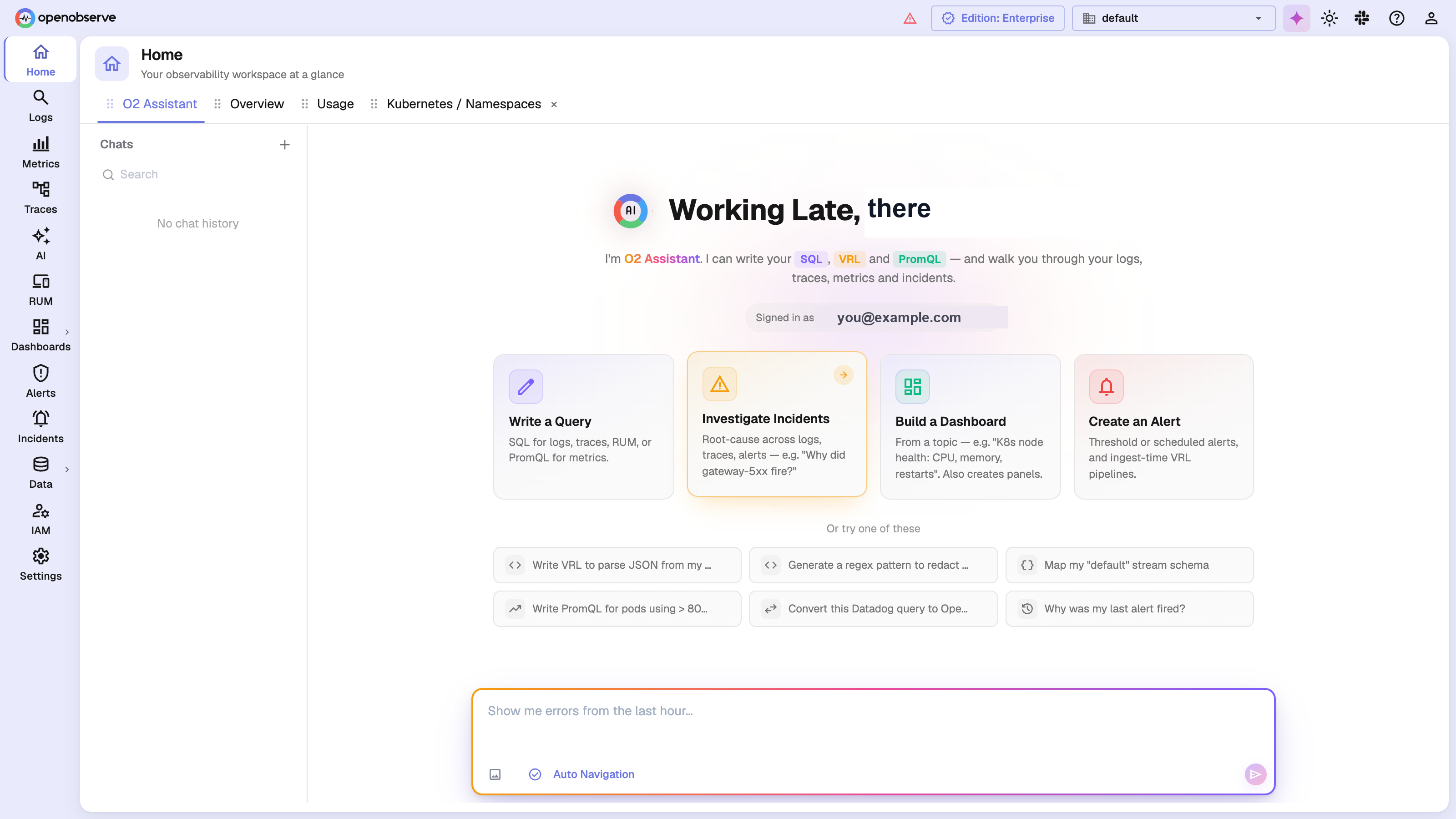
Readability and information density. The logs page was rebuilt with faster rendering, search highlighting, and a cleaner field list, including grouping and expansion so a long list of fields stays manageable. It also picks sensible default columns for you: instead of dropping you into a wall of raw source, it detects the full-text-search fields and shows the actual log message up front, so you can read what happened without expanding every row. During streaming aggregations, a progress bar now signals a refresh while keeping already-streamed rows visible, instead of a full-page skeleton wiping the table every time results updated. We added a proper system of empty states and skeleton loaders across the home, logs, traces, and RUM views, so a screen tells you what is happening instead of sitting blank.
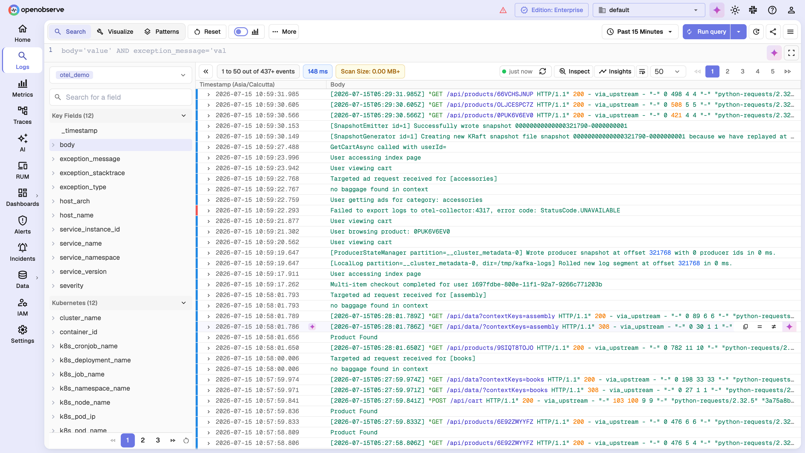
Controls you can pin. A redesign can quietly take choices away by deciding for you what belongs on screen. We went the other way. The logs toolbar now lets you pin the controls you actually use, the histogram, quick mode, SQL mode, saved views, the syntax guide, so your workspace matches how you work instead of how we guessed you work. Making the interface cleaner and handing you the switches are the same idea: respect the person using it.
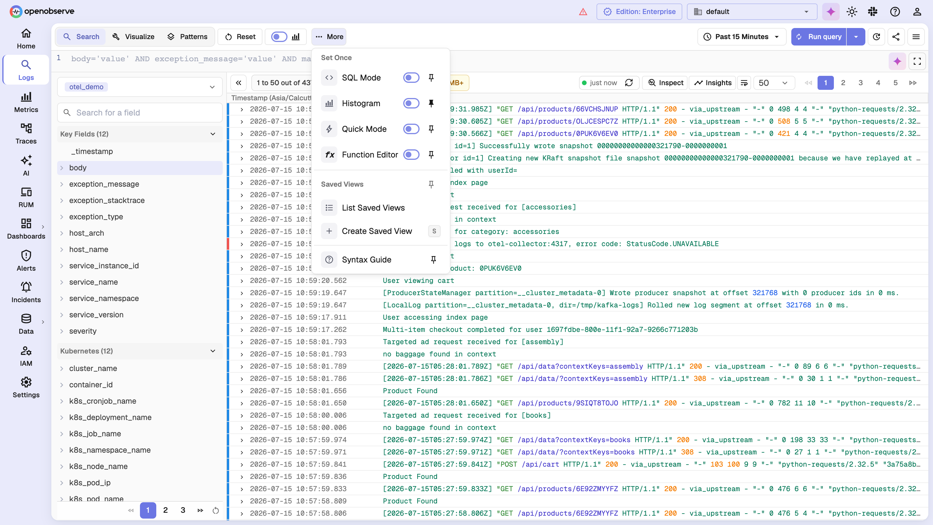
Dark mode and theming. We redesigned the theme drawer with a clean light and dark toggle, single-click theme selection, and theme persistence, all backed by a single central source of truth for theme colors and a long run of dark-mode color fixes. If you work in dark mode during incidents, the difference shows up in the details that used to be slightly off.
Authoring workflows. The visual pipeline editor gained an OR operator and nested conditions, so building branching logic is direct instead of a workaround. Dashboards picked up configurable legend types, gridline visibility, and per-column table formatting. We migrated form validation across the product to a consistent, schema-based approach, added clearable, redesigned search inputs, and reworked toasts and trace-detail tabs so the product tells you what it is doing instead of leaving you to guess.
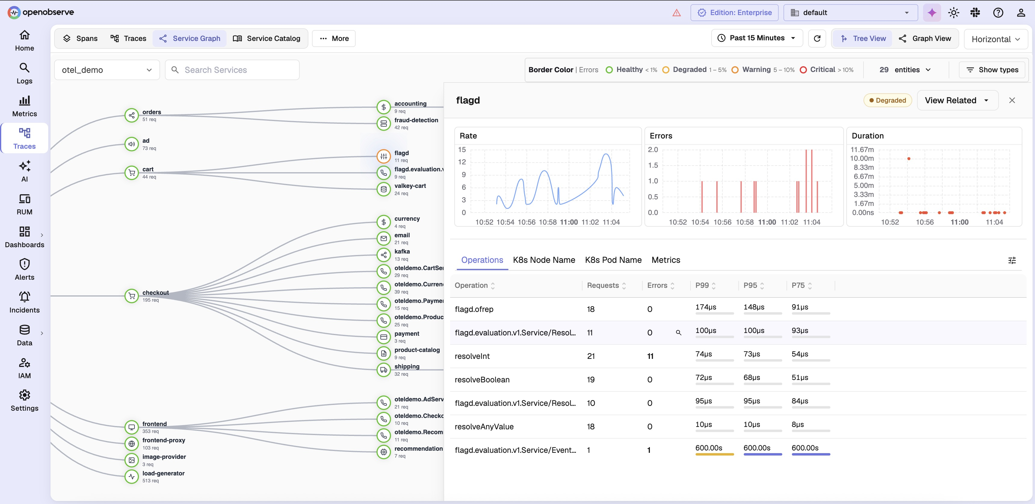
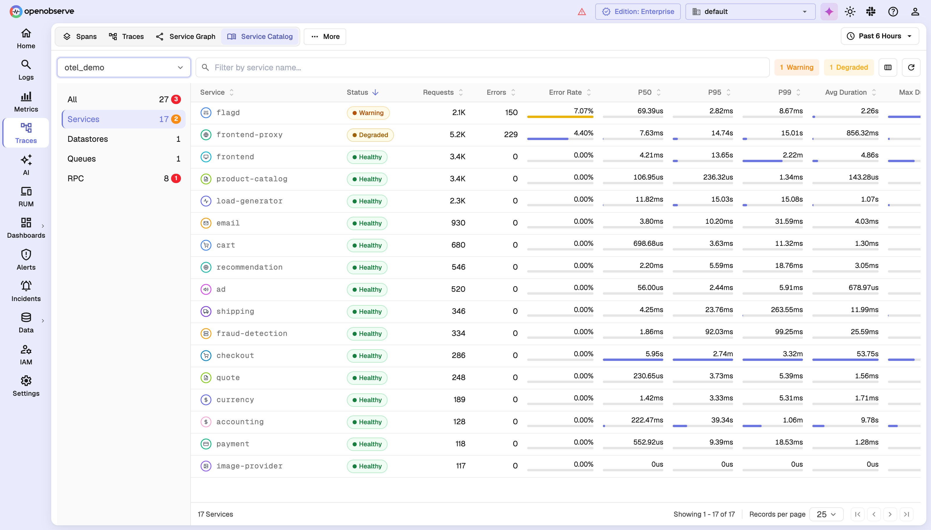
Traces, rethought. Traces got some of the deepest work. We refactored the service graph into a v2 UI with a tree view, edge latency trends, and node detail panels, so the map of how your services talk to each other is something you can actually read and interrogate instead of a tangle. We also added a service catalog inside traces, a structured view of your services rather than a raw span firehose. Both got proper no-data states so an empty view explains itself.
The service catalog is the same data as a ranked table: every service with its status, error rate, and P50, P95, and P99 latency, so you can spot the ones that are Critical or Degraded without hunting through the graph.
None of these individually is a headline. Together they are the difference between a tool you tolerate and one you are glad to open.
How we improved UX without trading away speed
The obvious risk in a UX overhaul is that you make the product prettier and slower. We treated speed as a constraint the redesign had to respect, not a luxury to spend.
The clearest example is how we load the Monaco code editor. It is a heavy dependency, and it was being pulled in on page load whether or not you needed it. We made it load lazily. The measured result on the home page: First Contentful Paint dropped from 1,244ms to 716ms, a 42% improvement, the initial bundle shrank by 41%, and memory use fell by 38%. On the logs page, time to interactive improved by about 20%. That is one change; performance work like it continued alongside the visual overhaul rather than pausing for it, spanning streaming, dashboard rendering, and metrics charts.
The point is not the single number. The point is that we stopped treating "fast" and "pleasant to use" as a choice you have to make. They were only ever in tension because of where we spent our attention, and that was something we could change.
Still improving the OpenObserve experience
We want to be honest about where this stands: v0.91.0 was the turning point, not the finish line. Work has carried straight into v0.92, with a rebuilt metrics explorer for faster exploration and a broad form-validation migration that keeps inputs consistent across every module. Smaller refinements keep shipping release over release.
We are saying this out loud for two reasons. First, to acknowledge plainly that the experience was not good enough for a while, and that the people who told us so were doing us a favor. Second, to be clear that we heard it, we acted on it, and we intend to keep acting on it. If something in the product still feels harder than it should, that is exactly the kind of feedback that produced this redesign, and it is still the fastest way to shape what we build next.
Get Involved
If you have not looked at OpenObserve since before v0.91.0, this is a good moment to look again, the interface you remember is not the one you will find. And if you do find something rough, tell us. The complaints that drove this work were specific and honest, and that is precisely what we want more of.
For more on how we build, see how to pin a dashboard to your home page for another UX request we shipped straight from user feedback, our take on observability cost optimization for the cost side of the bet this post opens with, and the best log visualization tools if you are evaluating how observability data should actually look on screen.
Ready to get started?
- Try OpenObserve Cloud: see the redesigned interface without installing anything.
- Download the latest release: self-host v0.91.0 or later to get the new experience.
- Read the docs: learn your way around logs, traces, metrics, dashboards, alerts, and pipelines.
Frequently Asked Questions
About the Author
Ashish Kolhe


Ashish leads Engineering at OpenObserve. Ashish is obsessed with building high performance systems with simplicity in mind. He has vast experience in multiple disciplines like streaming, analytics, big data and more.
Follow OpenObserve on Google
Add OpenObserve as a preferred source to see more of our articles in Google Search and Top Stories.